2024-07-23
Improving the Look of the Segmented Display

Series: Creating A Compose Multiplatform UI Library
- Create a Compose Multiplatform Library Project
- Making a Compose Multiplatform Segmented Display
- Improving the Look of the Segmented Display
- Shearing the Segmented Display
- Preparing for Release
- Releasing to Maven Central
Table of Contents
• Introduction
• TLDR
• Planning
• Implementation
• Recreate the rectangular 7-segment display with drawPath
• Compose Preview Refactoring
• Create our new drawClassic7SegmentChar function
• Check our new drawClassic7SegmentChar function
• Design the interface for specifying segment ends
• Calculate the relevant points
• Calculate the relevant slopes
• Implement the even, no gaps drawing
• Add The Gaps
• Naive Gaps
• Gaps on Asymmetric Segments
• Functions to supply angled segment ends
• Preset for Even Segments
• Preset for Symmetric Segments
• Preset for Asymmetric Segments
• Testing the presets
• Classic 7 Segment Display Composable
• Adding example code to the sample app
• Some housekeeping to the composeApp
• Demo App ShowDisplays function
• Creating a control assembly
• Adding other slider controls
• Adding the rest of the controls
• Conclusion
Introduction
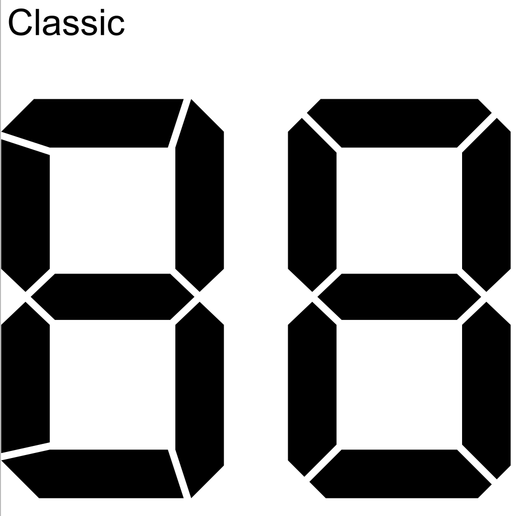
This is article 3 in the series about creating a Compose Multiplatform UI library. The previous article introduced usage of the canvas and the basics of a segmented display. This article builds on top of it by improving the look to match the "classic" 7-segment display created by posy.
At the end of this article, you'll complete a rectangular 7-segment display that looks like this (with the exception that we will implement shearing in the next article):
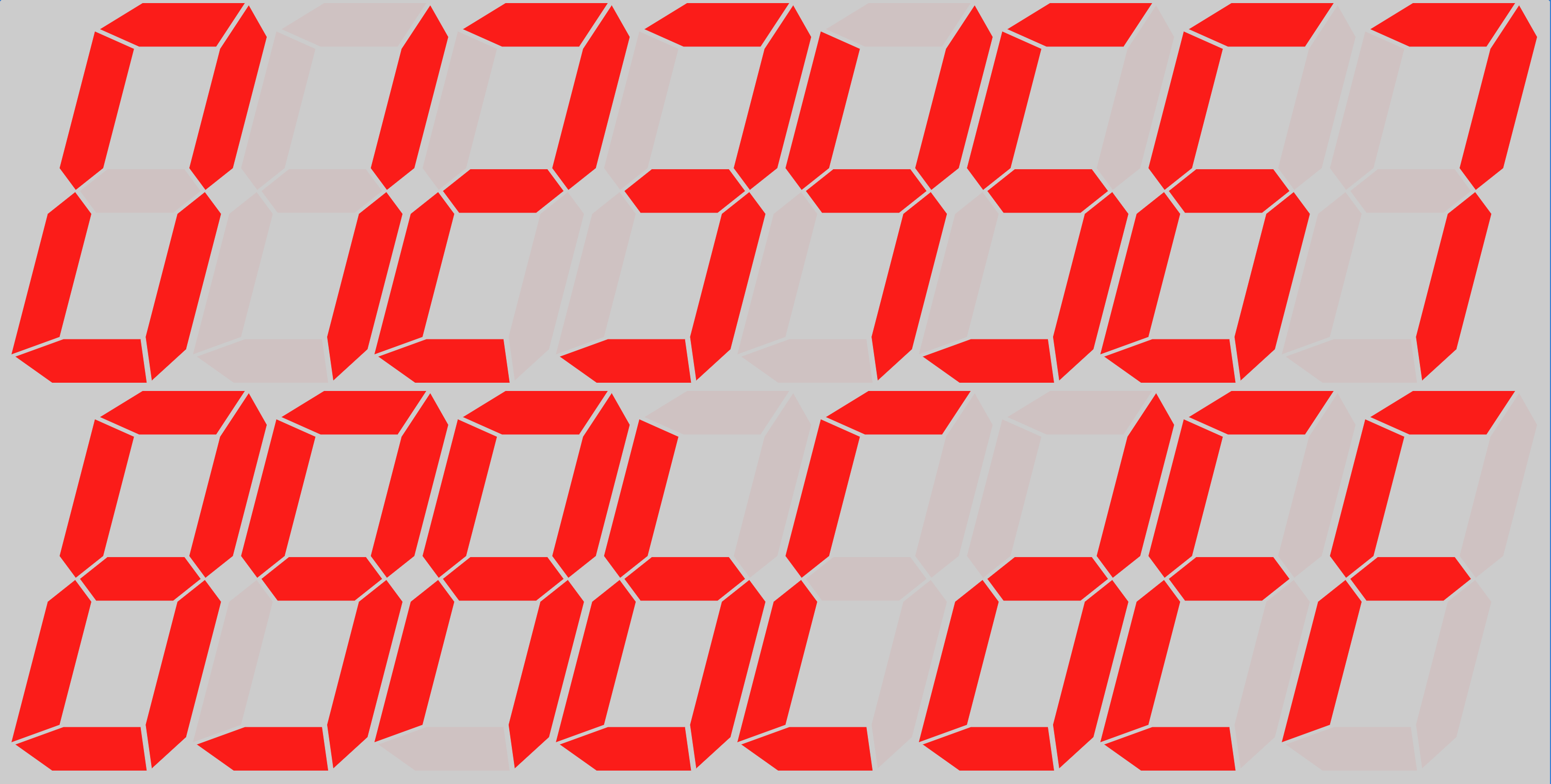
If this is the first article in the series you're reading, be aware that I'm making the assumption that you have read at least the previous article in this series. If you haven't, I recommend you read it first. Don't worry. This article will still be here for you when you're done.
The goal of this series is to provide an example of creating and deploying a Compose Multiplatform UI Library among other things. In a future article, we will be deploying this library to Maven Central. Once one has released a library, however, one is responsible for fixing bugs with that library--especially if they are reported by the library's consumers. In order to motivate this, I've intentionally left a bug in the code that I found when I was testing (it relates to the middle horizontal segment). We'll "find" and fix the bug and deploy the fix after we create the initial release.
TLDR
- Create a new
DrawScope.drawClassic7SegmentCharfunction that accepts a function argument that will return theAngledSegmentEndsgiven the index of the segment. - Create an
AngledSegmentEndsinterface that specifies the ends of a segment. - Implement each segment, first calculating the positions of each point and then calculating the slopes between the relevant points at the segment intersections.
- Use the slopes to calculate the intermediate points between the segment intersections.
- Verify your changes via Compose Previews
- Create a
SegmentActivatorfunction that will enable you to activate/deactivate segments in the preview. - Modify the
composeAppmodule to demonstrate the changes you've made.
Planning
We're sticking to sharp angles, reminiscent of the 80's for this article. In a future article, we may explore rounding the corners. You don't have to do this every time you work with the Canvas, but I find it particularly useful in situations like this to design with pencil and graph paper.
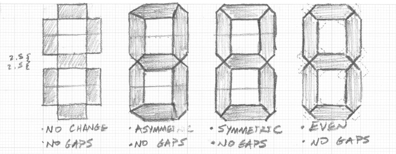
In order to progressively get to our end goal, we're going to break the problem down into the following steps:
- Recreate the rectangular 7-segment display (the no-change, no gaps drawing)
- Design the interface for specifying segment ends
- Implement the even, no gaps drawing, verifying our interface for specifying the segment ends meets that case
- Add the gaps
- Implement the symmetric drawing via segment end configuration
- Implement the asymmetric drawing via segment end configuration
In the end, we'll be left with a flexible, configurable, angled 7-segment display that can be configured to look like the "Classic," "Classic Bold," and "Classic Black" 7-segment display from Posy's drawings. We'll also have presets for achieving the symmetric and asymmetric designs and an additional preset for achieving a completely even design.
Implementation
Looking at the drawing in the planning section, it contains segments of three different shapes:
- Rectangles
- Pentagons
- Hexagons
Therefore, we'll have to implement a DrawScope.(/* ... */) -> Unit function that is capable of drawing paths instead of rectangles, as we previously did with the rectangular 7-segment display. Our function will need a means of passing the end configuration for each end of each segment ends. We'll start by figuring out just how to specify the ends of each segment.
Recreate the rectangular 7-segment display with drawPath
In our previous article, we created a rectangular 7-segment display using the drawRect function for each segment. Because we know we're going to need to make custom shapes and configure the ends, lets start out by recreating the rectangular 7-segment display, this time using the drawPath function. This will give us a good starting point for our new function. Before we get into the implementation of our classic 7-segment display, lets first set up some preview infrastructure.
Compose Preview Refactoring
Recall from the Rect7SetmentDisplayPreview.kt file, we had the following test code that allowed us to activate/deactivate segments:
@Preview
@Composable
fun DrawRect7SegmentChar() {
    Column {
        var activatedSegments by remember { mutableIntStateOf(0b01111111) }
        Canvas(
            modifier = Modifier.width(200.dp)
                .height(400.dp)
        ) {
            drawRect7SegmentChar(
                origin = Offset(x = 0F, y = 0F),
                activatedSegments = activatedSegments,
                width = size.width,
                height = size.height,
                topLeftPadding = Offset(x = 40F, y = 40F),
                bottomRightPadding = Offset(x = 40F, y = 40F),
                topAreaPercentage = 0.40F,
                thicknessMultiplier = 0.5F,
                gapSizeMultiplier = 4F,
                activatedColor = Color.Black
            )
        }
        Row(
            modifier = Modifier
                .width(200.dp)
                // rotating 180 degrees enables us to see the least significant bit on the RIGHT
                .rotate(180F),
            horizontalArrangement = Arrangement.spacedBy(1.dp)
        ) {
            for (i in 0 until 7) {
                val activated = (activatedSegments and (1 shl i)) != 0
                Box(
                    modifier = Modifier.height(50.dp)
                        .weight(1F)
                        .background(if (activated) Color.Red else Color.Red.copy(alpha = 0.25F))
                        .clickable { activatedSegments = activatedSegments xor (1 shl i) }
                )
            }
        }
    }
}
A tool enabling activatation/deactivation of segments in the preview is very useful. Now that we're going to have more than one function that draws a segmented display character, lets leverage Compose to compose a function that will make our tool generic. First, create SegmentedDisplayPreviewTools.kt file in the same directory as Rect7SegmentDisplayPreview.kt and export the tool that enables activation/deactivation of segments:
@Composable
fun SegmentActivator(
    numSegments: Int = 7,
    content: @Composable (activatedSegments: Int) -> Unit
) {
    Column(
        horizontalAlignment = Alignment.CenterHorizontally,
        verticalArrangement = Arrangement.spacedBy(8.dp)
    ) {
        var activatedSegments by remember { mutableIntStateOf(0b01111111) }
        content(activatedSegments)
        Row(
            modifier = Modifier
                .fillMaxWidth()
                // rotating 180 degrees enables us to see the least significant bit on the RIGHT
                .rotate(180F),
            horizontalArrangement = Arrangement.spacedBy(1.dp)
        ) {
            for (i in 0 until numSegments) {
                val activated = (activatedSegments and (1 shl i)) != 0
                Box(
                    modifier = Modifier.height(50.dp)
                        .weight(1F)
                        .background(if (activated) Color.Red else Color.Red.copy(alpha = 0.25F))
                        .clickable { activatedSegments = activatedSegments xor (1 shl i) }
                )
            }
        }
    }
}
Because we updated the Modifier of the row of buttons to fillMaxWidth(), this will cause the buttons to take up more horizontal space. Therefore, we improved the look of the preview by centering the views in the Column horizontally.
Then update the DrawRect7SegmentChar preview function to use this new tool:
@Preview
@Composable
fun DrawRect7SegmentChar() {
    SegmentActivator { activatedSegments ->
        Canvas(
            modifier = Modifier
                .width(200.dp)
                .height(400.dp)
        ) {
            drawRect7SegmentChar(
                origin = Offset(x = 0F, y = 0F),
                activatedSegments = activatedSegments,
                width = size.width,
                height = size.height,
                topLeftPadding = Offset(x = 40F, y = 40F),
                bottomRightPadding = Offset(x = 40F, y = 40F),
                topAreaPercentage = 0.40F,
                thicknessMultiplier = 0.5F,
                gapSizeMultiplier = 4F,
                activatedColor = Color.Black
            )
        }
    }
}
You should check now that your preview is still working properly. If it is, then you can proceed to the next step.
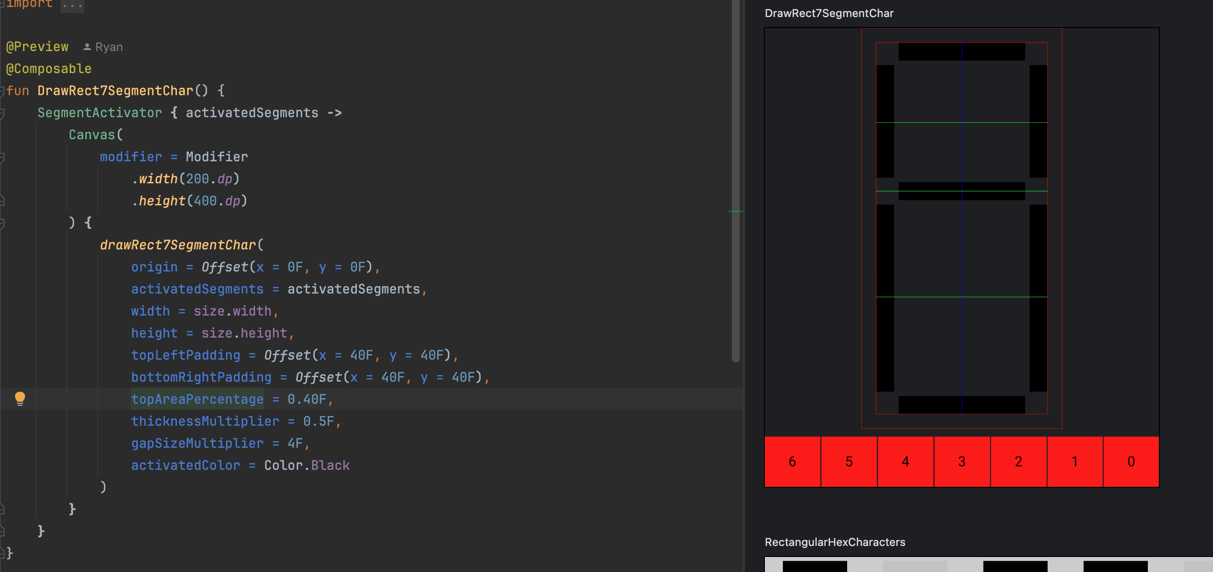
Personally, I found it would have been better to have segment index labels on the buttons. So I added them. Here's the full SegmentActivator function:
@Composable
fun SegmentActivator(
    numSegments: Int = 7,
    textMeasurer: TextMeasurer = rememberTextMeasurer(),
    content: @Composable (activatedSegments: Int) -> Unit
) {
    val density = LocalDensity.current.density
    Column(
        horizontalAlignment = Alignment.CenterHorizontally,
        verticalArrangement = Arrangement.spacedBy(8.dp)
    ) {
        var activatedSegments by remember { mutableIntStateOf(0b01111111) }
        content(activatedSegments)
        Row(
            modifier = Modifier
                .fillMaxWidth()
                // rotating 180 degrees enables us to see the least significant bit on the RIGHT
                .rotate(180F),
            horizontalArrangement = Arrangement.spacedBy(1.dp)
        ) {
            for (i in 0 until numSegments) {
                val activated = (activatedSegments and (1 shl i)) != 0
                val text = i.toString()
                val measuredSize = textMeasurer.measure(text)
                Box(
                    modifier = Modifier
                        .height(50.dp)
                        .weight(1F)
                        .background(if (activated) Color.Red else Color.Red.copy(alpha = 0.25F))
                        .clickable { activatedSegments = activatedSegments xor (1 shl i) },
                    contentAlignment = Alignment.Center
                ) {
                    Canvas(
                        modifier = Modifier.width((measuredSize.size.width / density).dp)
                            .height((measuredSize.size.height / density).dp)
                            .rotate(180F)   // <-- this re-flips the text, since the view itself was flipped
                    ) {
                        drawText(textMeasurer = textMeasurer, "$i", topLeft = Offset.Zero)
                    }
                }
            }
        }
    }
}
When you're done, your preview should look like this:
Create our new drawClassic7SegmentChar function
Start by creating a new file called Classic7SegmentDisplay.kt in the same directory as the existing Rect7SegmentDisplay.kt file. Then copy the signature of the DrawScope.drawRect7SegmentChar(/* args*/) function, changing the function name to drawClassic7SegmentChar. This will be very similar to what we will need to draw the classic 7-segment display. Here is the signature:
fun DrawScope.drawClassic7SegmentChar(
    origin: Offset,
    activatedSegments: Int,
    width: Float,
    height: Float,
    topLeftPadding: Offset,
    bottomRightPadding: Offset,
    topAreaPercentage: Float,
    thicknessMultiplier: Float,
    gapSizeMultiplier: Float,
    activatedColor: Color,
    deactivatedColor: Color = activatedColor.copy(alpha = 0.05F),
    debuggingEnabled: Boolean = true
) {
    /* ... */
}
Next, take the important values that serve as anchor points from the drawRect7SegmentChar function and update them to be used in the drawClassic7SegmentChar function. Here are the values we need for this function:
// Here we define some important values that serve as anchor points and
// sizes that can be referenced to draw correctly
val drawableWidth = width - topLeftPadding.x - bottomRightPadding.x
val leftmostX = origin.x + topLeftPadding.x
val rightmostX = leftmostX + drawableWidth
val topY = origin.y + topLeftPadding.y
val drawableHeight = height - topLeftPadding.y - bottomRightPadding.y
val centerX = leftmostX + drawableWidth / 2
val centerY = topY + drawableHeight * topAreaPercentage

val thickness = 29F / 240.37F * drawableHeight * thicknessMultiplier
val gapSize = thickness / 10 * gapSizeMultiplier

val baseHorizontalSegmentLeftX = leftmostX + thickness
val baseHorizontalSegmentRightX = baseHorizontalSegmentLeftX + drawableWidth - 2 * thickness

val middleHorizontalSegmentTopY = centerY - thickness / 2
val middleHorizontalSegmentBottomY = centerY + thickness / 2

val bottomHorizontalSegmentBottomY = topY + drawableHeight
val bottomHorizontalSegmentTopY = bottomHorizontalSegmentBottomY - thickness

val baseTopVerticalSegmentTopY = topY + thickness
val baseTopVerticalSegmentBottomY = middleHorizontalSegmentTopY
val baseBottomVerticalSegmentTopY = middleHorizontalSegmentBottomY
val baseBottomVerticalSegmentBottomY = topY + drawableHeight - thickness

val leftVerticalSegmentRightX = baseHorizontalSegmentLeftX
val rightVerticalSegmentLeftX = rightmostX - thickness
val rightVerticalSegmentRightX = rightmostX
We will use gapSize later.
These important values are different because we are using the drawPath function instead of the drawRect function. Whereas the drawRect function required the top-left and the size of the rectangle, the drawPath function allows for drawing lines between points, which makes calculating lengths unnecessary.
Now, updating the drawRect calls to drawPath looks like this: Presently, we have:
// top horizontal segment
drawPath(
    color = if (activatedSegments and 0b1 != 0) activatedColor else deactivatedColor,
    path = Path().apply {
        val topHorizontalSegmentBottomY = topY + thickness
        moveTo(x = baseHorizontalSegmentLeftX, y = topY)
        lineTo(x = baseHorizontalSegmentRightX, y = topY)
        lineTo(x = baseHorizontalSegmentRightX, y = topHorizontalSegmentBottomY)
        lineTo(x = baseHorizontalSegmentLeftX, y = topHorizontalSegmentBottomY)
        close()
    }
)
// middle horizontal segment
drawPath(
    color = if (activatedSegments and 0b1000 != 0) activatedColor else deactivatedColor,
    path = Path().apply {
        moveTo(x = baseHorizontalSegmentLeftX, y = middleHorizontalSegmentTopY)
        lineTo(x = baseHorizontalSegmentRightX, y = middleHorizontalSegmentTopY)
        lineTo(x = baseHorizontalSegmentRightX, y = middleHorizontalSegmentBottomY)
        lineTo(x = baseHorizontalSegmentLeftX, y = middleHorizontalSegmentBottomY)
        close()
    }
)
// bottom horizontal segment
drawPath(
    color = if (activatedSegments and 0b1000000 != 0) activatedColor else deactivatedColor,
    path = Path().apply {
        moveTo(x = baseHorizontalSegmentLeftX, y = bottomHorizontalSegmentTopY)
        lineTo(x = baseHorizontalSegmentRightX, y = bottomHorizontalSegmentTopY)
        lineTo(x = baseHorizontalSegmentRightX, y = bottomHorizontalSegmentBottomY)
        lineTo(x = baseHorizontalSegmentLeftX, y = bottomHorizontalSegmentBottomY)
        close()
    }
)
// top-left vertical segment
drawPath(
    color = if (activatedSegments and 0b10 != 0) activatedColor else deactivatedColor,
    path = Path().apply {
        moveTo(x = leftmostX, y = baseTopVerticalSegmentTopY)
        lineTo(x = leftVerticalSegmentRightX, y = baseTopVerticalSegmentTopY)
        lineTo(x = leftVerticalSegmentRightX, y = baseTopVerticalSegmentBottomY)
        lineTo(x = leftmostX, y = baseTopVerticalSegmentBottomY)
        close()
    }
)
// top-right vertical segment
drawPath(
    color = if (activatedSegments and 0b100 != 0) activatedColor else deactivatedColor,
    path = Path().apply {
        moveTo(x = rightVerticalSegmentLeftX, y = baseTopVerticalSegmentTopY)
        lineTo(x = rightVerticalSegmentRightX, y = baseTopVerticalSegmentTopY)
        lineTo(x = rightVerticalSegmentRightX, y = baseTopVerticalSegmentBottomY)
        lineTo(x = rightVerticalSegmentLeftX, y = baseTopVerticalSegmentBottomY)
        close()
    }
)
// bottom-left vertical segment
drawPath(
    color = if (activatedSegments and 0b10000 != 0) activatedColor else deactivatedColor,
    path = Path().apply {
        moveTo(x = leftmostX, y = baseBottomVerticalSegmentTopY)
        lineTo(x = leftVerticalSegmentRightX, y = baseBottomVerticalSegmentTopY)
        lineTo(x = leftVerticalSegmentRightX, y = baseBottomVerticalSegmentBottomY)
        lineTo(x = leftmostX, y = baseBottomVerticalSegmentBottomY)
        close()
    }
)
// bottom-right vertical segment
drawPath(
    color = if (activatedSegments and 0b100000 != 0) activatedColor else deactivatedColor,
    path = Path().apply {
        moveTo(x = rightVerticalSegmentLeftX, y = baseBottomVerticalSegmentTopY)
        lineTo(x = rightVerticalSegmentRightX, y = baseBottomVerticalSegmentTopY)
        lineTo(x = rightVerticalSegmentRightX, y = baseBottomVerticalSegmentBottomY)
        lineTo(x = rightVerticalSegmentLeftX, y = baseBottomVerticalSegmentBottomY)
        close()
    }
)
The activatedBrush and deactivatedBrush values are no longer necessary. drawPath will use the SolidColor brush when you pass the color parameter instead of the brush parameter.
Check our new drawClassic7SegmentChar function
Create a new file called Classic7SegmentDisplayPreview.kt in the same directory as our previous Rect7SegmentDisplayPreview.kt file (this should be in the androidDebug source set).
Add the following code to test that you successfully created all the paths. Remember that you can start interactive mode to click the buttons that activate/deactivate segments.
@Composable
@Preview
fun DrawClassic7SegmentChar() {
    SegmentActivator { activatedSegments ->
        Canvas(
            modifier = Modifier
                .width(200.dp)
                .height(400.dp)
        ) {
            drawClassic7SegmentChar(
                origin = Offset(x = 0F, y = 0F),
                activatedSegments = activatedSegments,
                width = size.width,
                height = size.height,
                topLeftPadding = Offset(x = 40F, y = 40F),
                bottomRightPadding = Offset(x = 40F, y = 40F),
                topAreaPercentage = 0.40F,
                thicknessMultiplier = 0.5F,
                gapSizeMultiplier = 4F,
                activatedColor = Color.Black
            )
        }
    }
}
The gapSizeMultiplier is not yet implemented. We'll add that later in this article.
For completeness, lets now copy the code for debugging from the drawRect7SegmentChar function to the drawClassic7SegmentChar function. This needs to be at the end of the function. Here is the code:
// debugging
if (debuggingEnabled) {
    // Allocated Area
    drawRect(
        brush = SolidColor(Color.Red),
        topLeft = Offset(x = 0F, y = 0F),
        size = Size(width = width, height = height),
        style = Stroke(width = Stroke.HairlineWidth)
    )
    // Drawable Area
    drawRect(
        brush = SolidColor(Color.Red),
        topLeft = Offset(x = leftmostX, y = topY),
        size = Size(width = drawableWidth, height = drawableHeight),
        style = Stroke(width = Stroke.HairlineWidth)
    )
    // Vertical center line
    drawLine(
        brush = SolidColor(Color.Blue),
        start = Offset(x = centerX, y = topY),
        end = Offset(x = centerX, y = topY + drawableHeight)
    )
    // Horizontal Center line of the top segment
    drawLine(
        brush = SolidColor(Color.Green),
        start = Offset(x = leftmostX, y = centerY),
        end = Offset(x = leftmostX + drawableWidth, y = centerY),
    )
    // Center line of the top area
    val topAreaCenterLine = (topY + centerY + thickness / 2) / 2
    drawLine(
        brush = SolidColor(Color.Green),
        start = Offset(x = leftmostX, y = topAreaCenterLine),
        end = Offset(x = leftmostX + drawableWidth, y = topAreaCenterLine),
    )
    // Center line of the bottom area
    val bottomAreaCenterLine = (centerY + topY + drawableHeight - thickness / 2) / 2
    drawLine(
        brush = SolidColor(Color.Green),
        start = Offset(x = leftmostX, y = bottomAreaCenterLine),
        end = Offset(x = leftmostX + drawableWidth, y = bottomAreaCenterLine),
    )
}
When you're done, your preview should look like this:
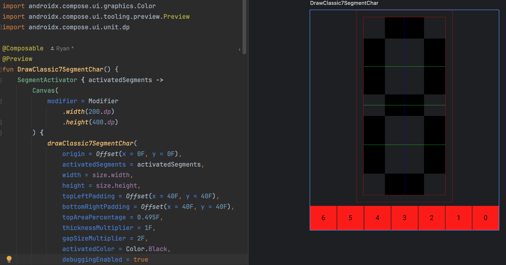
This looks exactly the same as the drawRect7SegmentChar function--which was the point of this step. We're just verifying that we can draw the same thing with drawPath as we did with drawRect.
Design the interface for specifying segment ends
After drawing the segments in the planning section, I made the following observations:
- Segments (except the center segment) have an outer and an inner edge. We'll just define the "outer" edge of the center section to be its upper edge and the "inner" edge to be its lower edge.
- Looking at the rectangular segments as a base, the ends of the segments may take up space within the square above/beside the rectangle. We'll call this the "end area" because I don't know a better term for it. There are six such end areas.
- Segments cannot overlap in the physical world, thus, the amount of the end area taken by a segment and the orthogonal segments needs to be configured.
- The division between segments at the intersection point (within the end area) is not always in the same spot. For example, in the "asymmetric" drawing, the top horizontal segment and the top-left vertical segment intersection is all the way to the top-left segment's top outer corner. However, the symmetric and even drawings have the intersection point in middle.
Finally, we have to choose a nomenclature for the configurable properties of the segment ends, and given that the segments are in different orientations, it's difficult to choose a nomenclature that fits all segments. So we will choose "left" and "right" to describe the area to the left and right of the horizontal segments. For the vertical segments on the left, we will imagine the "left" as the left after we've rotated the segment 90 degrees clockwise. For the vertical segments on the right, the "left" will be the left after we've rotated the segment 90 degrees counter-clockwise.
I'll admit that this nomenclature is not perfect. However, it is the best I could come up with. If you have a better idea, please let me know in the comments. I'm open to your suggestions.
Therefore--here is our interface that specifies the ends of a segment (presently):
interface AngledSegmentEnds {
    val innerEdgeLeftArea: Float
    val innerEdgeRightArea: Float
    val outerEdgeLeftArea: Float
    val outerEdgeRightArea: Float
    val leftIntersectionPct: Float
    val rightIntersectionPct: Float

    companion object {
        val EVEN = AngledSegmentEnds(
            innerEdgeLeftArea = 0F,
            innerEdgeRightArea = 0F,
            outerEdgeLeftArea = 0F,
            outerEdgeRightArea = 0F,
            leftIntersectionPct = 0.5F,
            rightIntersectionPct = 0.5F
        )
    }
}
We will also need a way to create one of these AngledSegmentEnds objects, so we'll add this function (and class):
@JsName("createAngledSegmentEnd")
fun AngledSegmentEnds(
    innerEdgeLeftArea: Float,
    innerEdgeRightArea: Float,
    outerEdgeLeftArea: Float,
    outerEdgeRightArea: Float,
    leftIntersectionPct: Float,
    rightIntersectionPct: Float
): AngledSegmentEnds = AngledSegmentEndsData(
    innerEdgeLeftArea = innerEdgeLeftArea,
    innerEdgeRightArea = innerEdgeRightArea,
    outerEdgeLeftArea = outerEdgeLeftArea,
    outerEdgeRightArea = outerEdgeRightArea,
    leftIntersectionPct = leftIntersectionPct,
    rightIntersectionPct = rightIntersectionPct
)

private data class AngledSegmentEndsData(
    override val innerEdgeLeftArea: Float,
    override val innerEdgeRightArea: Float,
    override val outerEdgeLeftArea: Float,
    override val outerEdgeRightArea: Float,
    override val leftIntersectionPct: Float,
    override val rightIntersectionPct: Float
): AngledSegmentEnds
You may have some questions about why chose to use an interface and a data class and a top level function instead of just using a data class with a constructor. This is one way to realize the "factory method" pattern as described in the seminal Gang of Four. An explanation of this pattern is too much of a tangent to include in this article, however, if you want to read further, I recommend starting on wikipedia. In Kotlin (and perhaps other languages), this realization of the factory method pattern is sometimes called a "pseudo constructor," and it is widely used in libraries and frameworks like Compose and Coroutines.
Calculate the relevant points
The goal of this section is to implement the part of the drawing in the planning section that has completely even segments. First, we'll need to update our DrawScope.drawClassic7SegmentChar function to accept a function argument that will return the AngledSegmentEnds given the index of the segment. Here's the updated function signature:
fun DrawScope.drawClassic7SegmentChar(
    origin: Offset,
    activatedSegments: Int,
    width: Float,
    height: Float,
    topLeftPadding: Offset,
    bottomRightPadding: Offset,
    topAreaPercentage: Float,
    thicknessMultiplier: Float,
    gapSizeMultiplier: Float,
    activatedColor: Color,
    deactivatedColor: Color = activatedColor.copy(alpha = 0.05F),
    debuggingEnabled: Boolean = true,
    angledSegmentEndOf: (Int) -> AngledSegmentEnd = { AngledSegmentEnd.EVEN }
) {
    /* ... */
}
Next, we'll need to update the calculations to use the AngledSegmentEnds values, inserting points where appropriate. Before we get started with the code, lets notice some things about the way the segments are constructed. Here's the relevant excerpt from Posy's segment sheet:

While we're not implementing the gaps at the moment, notice that the gaps form parallel lines with the outer edges of the segments. If we're not careful, we could implement characters that look about right when they are small, but when they're big, they look haphazardly designed. Our approach to ensure that we achieve parallel edges will be to calculate the slope between the outer edge vertex of the Also notice that the gaps are the same size, but when the shape of the segments is asymmetric, the gaps are applied unevenly.
Thus, we need to calculate each of the following points:
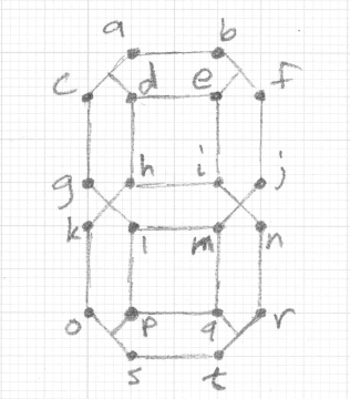
In order to help us calculate these points consistently, and because of our nomenclature when describing the ends of the segments ("left" and "right") we'll create some extension functions on AngledSegmentEnds that will calculate the points for us. Here are the extension functions:
private fun AngledSegmentEnds.horizOuterEdgeLeftX(baseX: Float, thickness: Float): Float = baseX - outerEdgeLeftArea * thickness
private fun AngledSegmentEnds.horizOuterEdgeRightX(baseX: Float, thickness: Float): Float = baseX + outerEdgeRightArea * thickness
private fun AngledSegmentEnds.horizInnerEdgeLeftX(baseX: Float, thickness: Float): Float = baseX - innerEdgeLeftArea * thickness
private fun AngledSegmentEnds.horizInnerEdgeRightX(baseX: Float, thickness: Float): Float = baseX + innerEdgeRightArea * thickness
private fun AngledSegmentEnds.leftVertOuterEdgeTopY(baseY: Float, thickness: Float): Float = baseY - outerEdgeRightArea * thickness
private fun AngledSegmentEnds.leftVertOuterEdgeBottomY(baseY: Float, thickness: Float): Float = baseY + outerEdgeLeftArea * thickness
private fun AngledSegmentEnds.leftVertInnerEdgeTopY(baseY: Float, thickness: Float): Float = baseY - innerEdgeRightArea * thickness
private fun AngledSegmentEnds.leftVertInnerEdgeBottomY(baseY: Float, thickness: Float): Float = baseY + innerEdgeLeftArea * thickness
private fun AngledSegmentEnds.rightVertOuterEdgeTopY(baseY: Float, thickness: Float): Float = baseY - outerEdgeLeftArea * thickness
private fun AngledSegmentEnds.rightVertOuterEdgeBottomY(baseY: Float, thickness: Float): Float = baseY + outerEdgeRightArea * thickness
private fun AngledSegmentEnds.rightVertInnerEdgeTopY(baseY: Float, thickness: Float): Float = baseY - innerEdgeLeftArea * thickness
private fun AngledSegmentEnds.rightVertInnerEdgeBottomY(baseY: Float, thickness: Float): Float = baseY + innerEdgeRightArea * thickness
Then, calculating these points (the points that are not calculated here are only used once):
val topHorizontalEnds = angledSegmentEndsOf(0)
val topHorizontalOuterEdgeLeftX = topHorizontalEnds.horizOuterEdgeLeftX(baseX = baseHorizontalSegmentLeftX, thickness)                          // a
val topHorizontalOuterEdgeRightX = topHorizontalEnds.horizOuterEdgeRightX(baseX = baseHorizontalSegmentRightX, thickness)                       // b

val topLeftVerticalEnds = angledSegmentEndsOf(1)
val topLeftVerticalOuterEdgeTopY = topLeftVerticalEnds.leftVertOuterEdgeTopY(baseY = baseTopVerticalSegmentTopY, thickness)                     // c
val topLeftVerticalOuterEdgeBottomY = topLeftVerticalEnds.leftVertOuterEdgeBottomY(baseY = baseTopVerticalSegmentBottomY, thickness)            // g

val topRightVerticalEnds = angledSegmentEndsOf(2)
val topRightVerticalOuterEdgeTopY = topRightVerticalEnds.rightVertOuterEdgeTopY(baseY = baseTopVerticalSegmentTopY, thickness)                  // f
val topRightVerticalOuterEdgeBottomY = topRightVerticalEnds.rightVertOuterEdgeBottomY(baseY = baseTopVerticalSegmentBottomY, thickness)         // j

val middleHorizontalEnds = angledSegmentEndsOf(3)
val middleHorizontalUpperEdgeLeftX = middleHorizontalEnds.horizOuterEdgeLeftX(baseX = baseHorizontalSegmentLeftX, thickness)                    // h
val middleHorizontalUpperEdgeRightX = middleHorizontalEnds.horizOuterEdgeRightX(baseX = baseHorizontalSegmentRightX, thickness)                 // i
val middleHorizontalLowerEdgeLeftX = middleHorizontalEnds.horizInnerEdgeLeftX(baseX = baseHorizontalSegmentLeftX, thickness)                    // l
val middleHorizontalLowerEdgeRightX = middleHorizontalEnds.horizInnerEdgeRightX(baseX = baseHorizontalSegmentRightX, thickness)                 // m

val bottomLeftVerticalEnds = angledSegmentEndsOf(4)
val bottomLeftVerticalOuterEdgeTopY = bottomLeftVerticalEnds.leftVertOuterEdgeTopY(baseY = baseBottomVerticalSegmentTopY, thickness)            // k
val bottomLeftVerticalOuterEdgeBottomY = bottomLeftVerticalEnds.leftVertOuterEdgeBottomY(baseY = baseBottomVerticalSegmentBottomY, thickness)   // o

val bottomRightEnds = angledSegmentEndsOf(5)
val bottomRightVerticalOuterEdgeTopY = bottomRightEnds.rightVertOuterEdgeTopY(baseY = baseBottomVerticalSegmentTopY, thickness)                 // n
val bottomRightVerticalOuterEdgeBottomY = bottomRightEnds.rightVertOuterEdgeBottomY(baseY = baseBottomVerticalSegmentBottomY, thickness)        // f
val bottomRightVerticalInnerEdgeTopY = bottomRightEnds.rightVertInnerEdgeTopY(baseY = baseBottomVerticalSegmentTopY, thickness)                 // m

val bottomHorizontalEnds = angledSegmentEndsOf(6)
val bottomHorizontalOuterEdgeLeftX = bottomHorizontalEnds.horizOuterEdgeLeftX(baseX = baseHorizontalSegmentLeftX, thickness)                    // s
val bottomHorizontalOuterEdgeRightX = bottomHorizontalEnds.horizOuterEdgeRightX(baseX = baseHorizontalSegmentRightX, thickness)                 // t
Calculate the relevant slopes
Next, we need to calculate the relevant slopes. There are eight in total because there are 8 different segment intersections. For ease of implementation, we always calculate them from left to right. It helps to have a slope calculation helper function:
internal fun slope(x1: Float, y1: Float, x2: Float, y2: Float): Float = (y2 - y1) / (x2 - x1)
Here are the calculations:
// slope c -> a
val topLeftCornerSlope = slope(x1 = leftmostX, y1 = topLeftVerticalOuterEdgeTopY, x2 = topHorizontalOuterEdgeLeftX, y2 = topY)
// slope b -> f
val topRightCornerSlope = slope(x1 = topHorizontalOuterEdgeRightX, y1 = topY, x2 = rightVerticalSegmentRightX, y2 = topRightVerticalOuterEdgeTopY)
// slope m -> j
val middleRightUpperToLowerSlope = slope(x1 = middleHorizontalUpperEdgeRightX, y1 = middleHorizontalSegmentTopY, x2 = rightmostX, y2 = bottomRightVerticalOuterEdgeTopY)
// slope i -> n
val middleRightLowerToUpperSlope = slope(x1 = rightVerticalSegmentLeftX, y1 = bottomRightVerticalInnerEdgeTopY, x2 = rightmostX, y2 = topRightVerticalOuterEdgeBottomY)
// slope t -> r
val bottomRightCornerSlope = slope(x1 = bottomHorizontalOuterEdgeRightX, y1 = bottomHorizontalSegmentBottomY, x2 = rightmostX, y2 = bottomRightVerticalOuterEdgeBottomY)
// slope o -> s
val bottomLeftCornerSlope = slope(x1 = leftmostX, y1 = bottomLeftVerticalOuterEdgeBottomY, x2 = bottomHorizontalOuterEdgeLeftX, y2 = bottomHorizontalSegmentBottomY)
// g -> l
val middleLeftUpperToLowerSlope = slope(x1 = leftmostX, y1 = topLeftVerticalOuterEdgeBottomY, x2 = middleHorizontalLowerEdgeLeftX, y2 = middleHorizontalSegmentBottomY)
// k -> h
val middleLeftLowerToUpperSlope = slope(x1 = leftmostX, y1 = bottomLeftVerticalOuterEdgeTopY, x2 = middleHorizontalUpperEdgeLeftX, y2 = middleHorizontalSegmentTopY)
Implement the even, no gaps drawing
Now that we have all the points and slopes calculated, we can start drawing the segments.
Top Horizontal Segment
The top horizontal segment is presently just a rectangle implemented with a path:
// top horizontal segment
drawPath(
    color = if (activatedSegments and 0b1 != 0) activatedColor else deactivatedColor,
    path = Path().apply {
        val topHorizontalSegmentBottomY = topY + thickness
        moveTo(x = baseHorizontalSegmentLeftX, y = topY)
        lineTo(x = baseHorizontalSegmentRightX, y = topY)
        lineTo(x = baseHorizontalSegmentRightX, y = topHorizontalSegmentBottomY)
        lineTo(x = baseHorizontalSegmentLeftX, y = topHorizontalSegmentBottomY)
        close()
    }
)
This becomes:
// top horizontal segment
drawPath(
    color = if (activatedSegments and 0b1 != 0) activatedColor else deactivatedColor,
    path = Path().apply {
        val topHorizontalSegmentBottomY = topY + thickness

        moveTo(x = topHorizontalOuterEdgeLeftX, y = topY)
        lineTo(x = topHorizontalOuterEdgeRightX, y = topY)

        val remainingRightEndArea = rightmostX - topHorizontalOuterEdgeRightX
        val rightIntermediateX = topHorizontalOuterEdgeRightX + topHorizontalEnds.rightIntersectionPct * remainingRightEndArea
        val rightIntermediateY = topY + topRightCornerSlope * (rightIntermediateX - topHorizontalOuterEdgeRightX)
        lineTo(x = rightIntermediateX, y = rightIntermediateY)
        lineTo(x = topHorizontalEnds.horizInnerEdgeRightX(baseX = baseHorizontalSegmentRightX, thickness), y = topHorizontalSegmentBottomY)
        lineTo(x = topHorizontalEnds.horizInnerEdgeLeftX(baseX = baseHorizontalSegmentLeftX, thickness), y = topHorizontalSegmentBottomY)

        val remainingLeftEndArea = topHorizontalOuterEdgeLeftX - leftmostX
        val leftIntermediateX = topHorizontalOuterEdgeLeftX - topHorizontalEnds.leftIntersectionPct * remainingLeftEndArea
        val leftIntermediateY = topY - topLeftCornerSlope * (topHorizontalOuterEdgeLeftX - leftIntermediateX)
        lineTo(x = leftIntermediateX, y = leftIntermediateY)
        close()
    }
)
Here, we calculate the intermediate points on the ends of the segment. Importantly, for horizontal segments, we use the AngledSegmentEnds.rightIntersectionPct and AngledSegmentEnds.leftIntersectionPct to calculate the x-coordinate of the intermediate points. Because we have the topRightCornerSlope and topLeftCornerSlope, we can then derive the y-coordinate of the intermediate points by multiplying the slope by the x-distance from the outer edge.
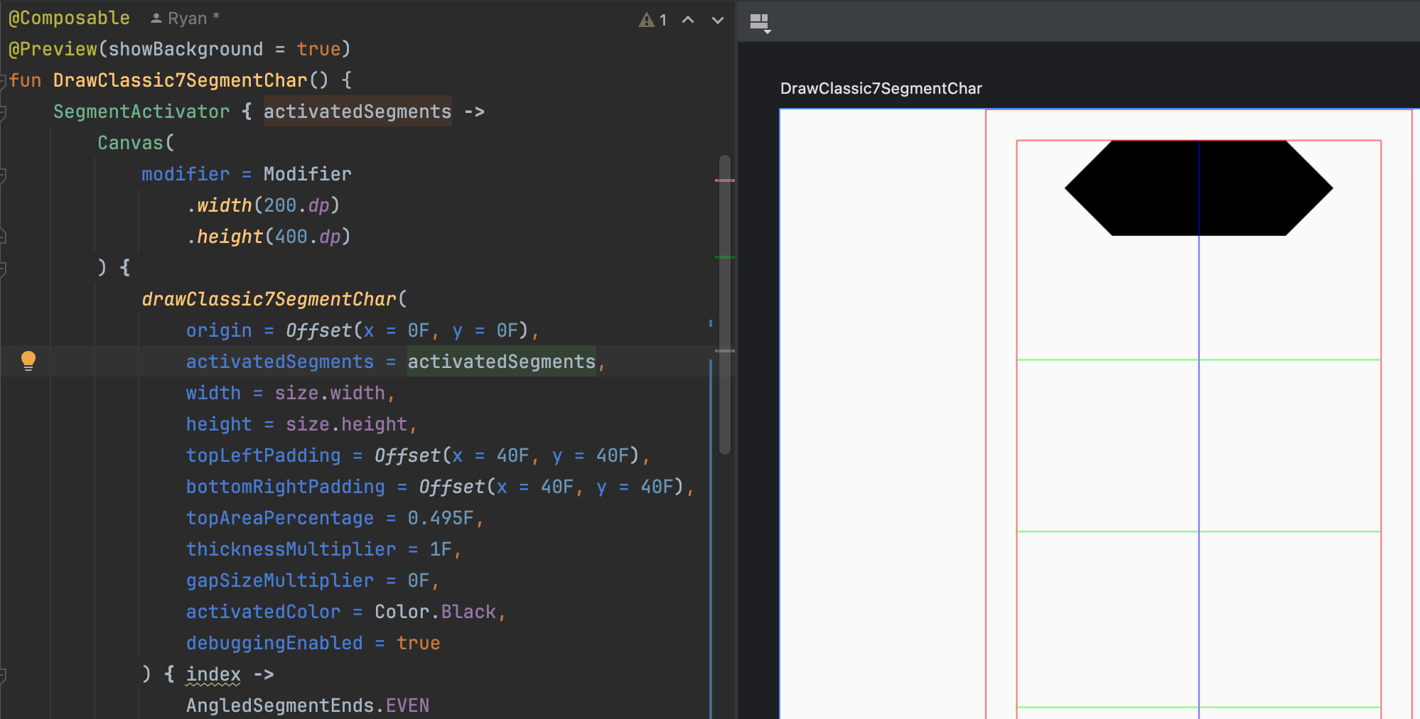
Check your preview to ensure that you've implemented the top horizontal segment correctly. It should look like this (with the other segments removed):
Top Left Vertical Segment
Vertical segments are different from horizontal segments in the way their intermediate values are calculated. Because the idea of "left" and "right" is rotated 90 degrees, in this case, we need to calculate the intermediate y-coordinate using AngledSegmentEnds.rightIntersectionPct and AngledSegmentEnds.leftIntersectionPct, deriving the intermediate x-coordinate using multiplying the slope by the y-distance from the outer edge. Because we've rotated by 90 degrees, we also need to invert the slop to calculate the x-position correctly.
// top-left vertical segment
drawPath(
    color = if (activatedSegments and 0b10 != 0) activatedColor else deactivatedColor,
    path = Path().apply {
        moveTo(x = leftmostX, y = topLeftVerticalOuterEdgeTopY)

        val remainingTopEndArea = topLeftVerticalOuterEdgeTopY - topY
        val topIntermediateY = topLeftVerticalOuterEdgeTopY - topLeftVerticalEnds.rightIntersectionPct * remainingTopEndArea
        val topIntermediateX = leftmostX + 1 / topLeftCornerSlope * (topIntermediateY - topLeftVerticalOuterEdgeTopY)
        lineTo(x = topIntermediateX, y = topIntermediateY)
        lineTo(x = leftVerticalSegmentRightX, y = topLeftVerticalEnds.leftVertInnerEdgeTopY(baseY = baseTopVerticalSegmentTopY, thickness))
        lineTo(x = leftVerticalSegmentRightX, y = topLeftVerticalEnds.leftVertInnerEdgeBottomY(baseY = baseTopVerticalSegmentBottomY, thickness))

        val remainingBottomEndArea = middleHorizontalSegmentBottomY - topLeftVerticalOuterEdgeBottomY
        val bottomIntermediateY = topLeftVerticalOuterEdgeBottomY + topLeftVerticalEnds.leftIntersectionPct * remainingBottomEndArea
        val bottomIntermediateX = leftmostX + 1 / middleLeftUpperToLowerSlope * (bottomIntermediateY - topLeftVerticalOuterEdgeBottomY)
        lineTo(x = bottomIntermediateX, y = bottomIntermediateY)
        lineTo(x = leftmostX, y = topLeftVerticalOuterEdgeBottomY)
        close()
    }
)
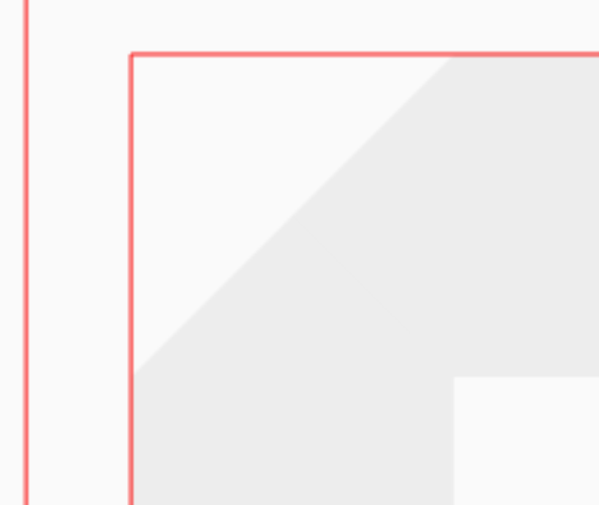
Stop here and check that you've implemented the top-left vertical segment correctly. It should look like this:
Sometimes you can mess up the sign of the slope when you're using it. When that happens, it looks like this:
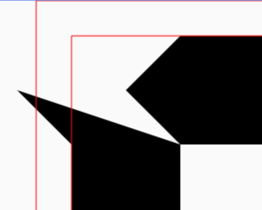
In these cases, just flip the operation you're using to derive the intermediate coordinate.
Middle Horizontal Segment
The middle horizontal segment is a bit more complicated because there are actually four segment intersections to care about. We need to calculate the intermediate points for the upper and lower edges separately. Note that this could lead to an octagonal middle segment. However, in practice, it seems to be that the middle segment and the design of the adjacent segment ends seems to be completely even in most designs.
    // middle horizontal segment
    drawPath(
        color = if (activatedSegments and 0b1000 != 0) activatedColor else deactivatedColor,
        path = Path().apply {
            // This path could possibly be an octagon because of the way we're calculating the intersection points

            moveTo(x = middleHorizontalUpperEdgeLeftX, y = middleHorizontalSegmentTopY)
            lineTo(x = middleHorizontalUpperEdgeRightX, y = middleHorizontalSegmentTopY)

            val upperRemainingRightEndArea = rightmostX - middleHorizontalUpperEdgeRightX
            val upperRightIntermediateX = middleHorizontalUpperEdgeRightX + middleHorizontalEnds.rightIntersectionPct * upperRemainingRightEndArea
            val upperRightIntermediateY = middleHorizontalSegmentTopY + middleRightUpperToLowerSlope * (upperRightIntermediateX - middleHorizontalUpperEdgeRightX)
            lineTo(x = upperRightIntermediateX, y = upperRightIntermediateY)

            val lowerRemainingRightEndArea = rightmostX - middleHorizontalLowerEdgeRightX
            val lowerRightIntermediateX = middleHorizontalLowerEdgeRightX + middleHorizontalEnds.rightIntersectionPct * lowerRemainingRightEndArea
            val lowerRightIntermediateY = middleHorizontalSegmentBottomY + middleRightLowerToUpperSlope * (lowerRightIntermediateX - middleHorizontalLowerEdgeRightX)
            lineTo(x = lowerRightIntermediateX, y = lowerRightIntermediateY)
            lineTo(x = middleHorizontalLowerEdgeRightX, y = middleHorizontalSegmentBottomY)
            lineTo(x = middleHorizontalLowerEdgeLeftX, y = middleHorizontalSegmentBottomY)

            val lowerRemainingLeftEndArea = middleHorizontalLowerEdgeLeftX - leftmostX
            val lowerLeftIntermediateX = middleHorizontalLowerEdgeLeftX - middleHorizontalEnds.leftIntersectionPct * lowerRemainingLeftEndArea
            val lowerLeftIntermediateY = middleHorizontalSegmentBottomY - middleLeftUpperToLowerSlope * (middleHorizontalLowerEdgeLeftX - lowerLeftIntermediateX)
            lineTo(x = lowerLeftIntermediateX, y = lowerLeftIntermediateY)

            val upperRemainingLeftEndArea = middleHorizontalUpperEdgeLeftX - leftmostX
            val upperLeftIntermediateX = middleHorizontalUpperEdgeLeftX - middleHorizontalEnds.leftIntersectionPct * upperRemainingLeftEndArea
            val upperLeftIntermediateY = middleHorizontalSegmentTopY + middleLeftLowerToUpperSlope * (upperLeftIntermediateX - middleHorizontalUpperEdgeLeftX)
            lineTo(x = upperLeftIntermediateX, y = upperLeftIntermediateY)

            close()
        }
    )
You should stop and check the preview to ensure that you've implemented the middle horizontal segment correctly. It should look like this:
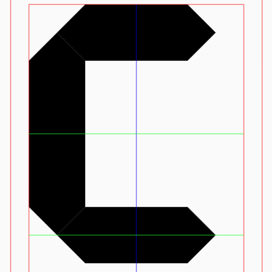
Add The Gaps
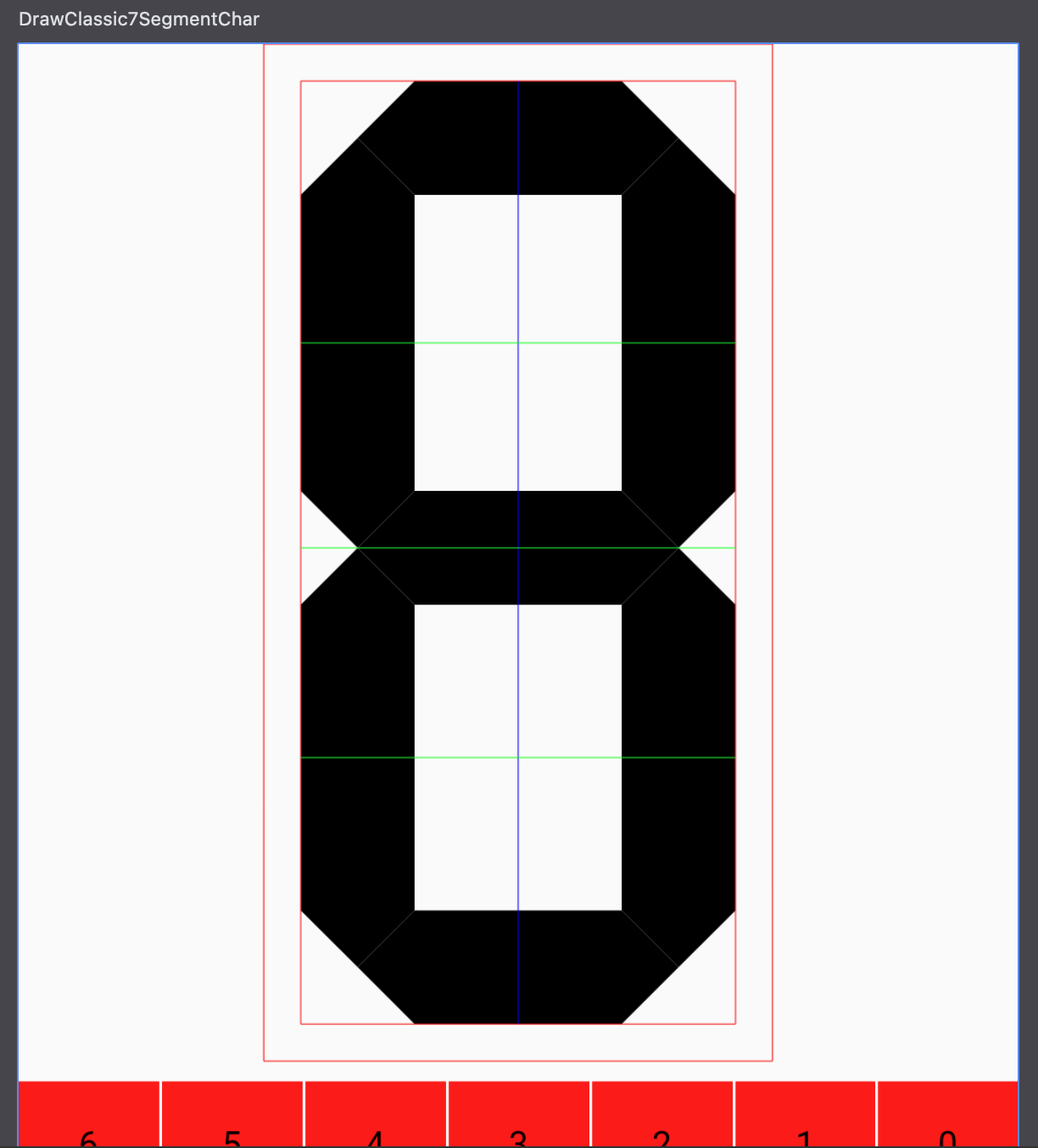
I'm going to omit the code that draws the rest of the segments because it's all pretty similar to what we've already done. I'll just add that if you allow an AI code generator to generate the rest, based upon what you've written so far, it comes up with some pretty interesting (and wrong) results. For completeness, however, I'll show our starting point here, just so that you can check that you're at the same point as I am:
Now lets remedy the fact that our segments do not have any gaps, which is a natural part of a segmented display in the real world. Our drawing in the planning section does not show any gaps, but given the work we've already done, we should be able to add them by offsetting the values we've calculated so far.
This is why we checked for overlap and gaps previously to check our slope calculations and how we applied the slope to derive the intermediate x or y coordinate.
Naive Gaps
Our first attempt at implementing the gaps will not be sufficient to achieve more complicated designs, but it's very straightforward. The approach will be to:
- Calculate half the gap size
- On the horizontal segments, add the half-gap-size to the left x-coordinates and subtract the half-gap-size from the right x-coordinates
- On the vertical segments, add the half-gap-size to the top y-coordinates and subtract the half-gap-size from the bottom y-coordinates
First, add the following line below val gapSize = thickness / 10 * gapSizeMultiplier:
val gapOffset = gapSize / 2
Then, apply our approach above to each segment. Here's the updated code for the top horizontal segment (the modification is similar for the other horizontal segments):
// top horizontal segment
drawPath(
    color = if (activatedSegments and 0b1 != 0) activatedColor else deactivatedColor,
    path = Path().apply {
        val topHorizontalSegmentBottomY = topY + thickness

        moveTo(x = topHorizontalOuterEdgeLeftX + gapOffset, y = topY)
        lineTo(x = topHorizontalOuterEdgeRightX - gapOffset, y = topY)

        val remainingRightEndArea = rightmostX - topHorizontalOuterEdgeRightX
        val rightIntermediateX = topHorizontalOuterEdgeRightX + topHorizontalEnds.rightIntersectionPct * remainingRightEndArea
        val rightIntermediateY = topY + topRightCornerSlope * (rightIntermediateX - topHorizontalOuterEdgeRightX)
        lineTo(x = rightIntermediateX - gapOffset, y = rightIntermediateY)
        lineTo(x = topHorizontalEnds.horizInnerEdgeRightX(baseX = baseHorizontalSegmentRightX, thickness) - gapOffset, y = topHorizontalSegmentBottomY)
        lineTo(x = topHorizontalEnds.horizInnerEdgeLeftX(baseX = baseHorizontalSegmentLeftX, thickness) + gapOffset, y = topHorizontalSegmentBottomY)

        val remainingLeftEndArea = topHorizontalOuterEdgeLeftX - leftmostX
        val leftIntermediateX = topHorizontalOuterEdgeLeftX - topHorizontalEnds.leftIntersectionPct * remainingLeftEndArea
        val leftIntermediateY = topY - topLeftCornerSlope * (topHorizontalOuterEdgeLeftX - leftIntermediateX)
        lineTo(x = leftIntermediateX + gapOffset, y = leftIntermediateY)
        close()
    }
)
And here's the updated code for the top-left vertical segment (the modification is similar for the other vertical segments):
// top-left vertical segment
drawPath(
    color = if (activatedSegments and 0b10 != 0) activatedColor else deactivatedColor,
    path = Path().apply {
        moveTo(x = leftmostX, y = topLeftVerticalOuterEdgeTopY + gapOffset)

        val remainingTopEndArea = topLeftVerticalOuterEdgeTopY - topY
        val topIntermediateY = topLeftVerticalOuterEdgeTopY - topLeftVerticalEnds.rightIntersectionPct * remainingTopEndArea
        val topIntermediateX = leftmostX + 1 / topLeftCornerSlope * (topIntermediateY - topLeftVerticalOuterEdgeTopY)
        lineTo(x = topIntermediateX, y = topIntermediateY + gapOffset)
        lineTo(x = leftVerticalSegmentRightX, y = topLeftVerticalEnds.leftVertInnerEdgeTopY(baseY = baseTopVerticalSegmentTopY, thickness) + gapOffset)
        lineTo(x = leftVerticalSegmentRightX, y = topLeftVerticalEnds.leftVertInnerEdgeBottomY(baseY = baseTopVerticalSegmentBottomY, thickness) - gapOffset)

        val remainingBottomEndArea = middleHorizontalSegmentBottomY - topLeftVerticalOuterEdgeBottomY
        val bottomIntermediateY = topLeftVerticalOuterEdgeBottomY + topLeftVerticalEnds.leftIntersectionPct * remainingBottomEndArea
        val bottomIntermediateX = leftmostX + 1 / middleLeftUpperToLowerSlope * (bottomIntermediateY - topLeftVerticalOuterEdgeBottomY)
        lineTo(x = bottomIntermediateX, y = bottomIntermediateY - gapOffset)
        lineTo(x = leftmostX, y = topLeftVerticalOuterEdgeBottomY - gapOffset)
        close()
    }
)
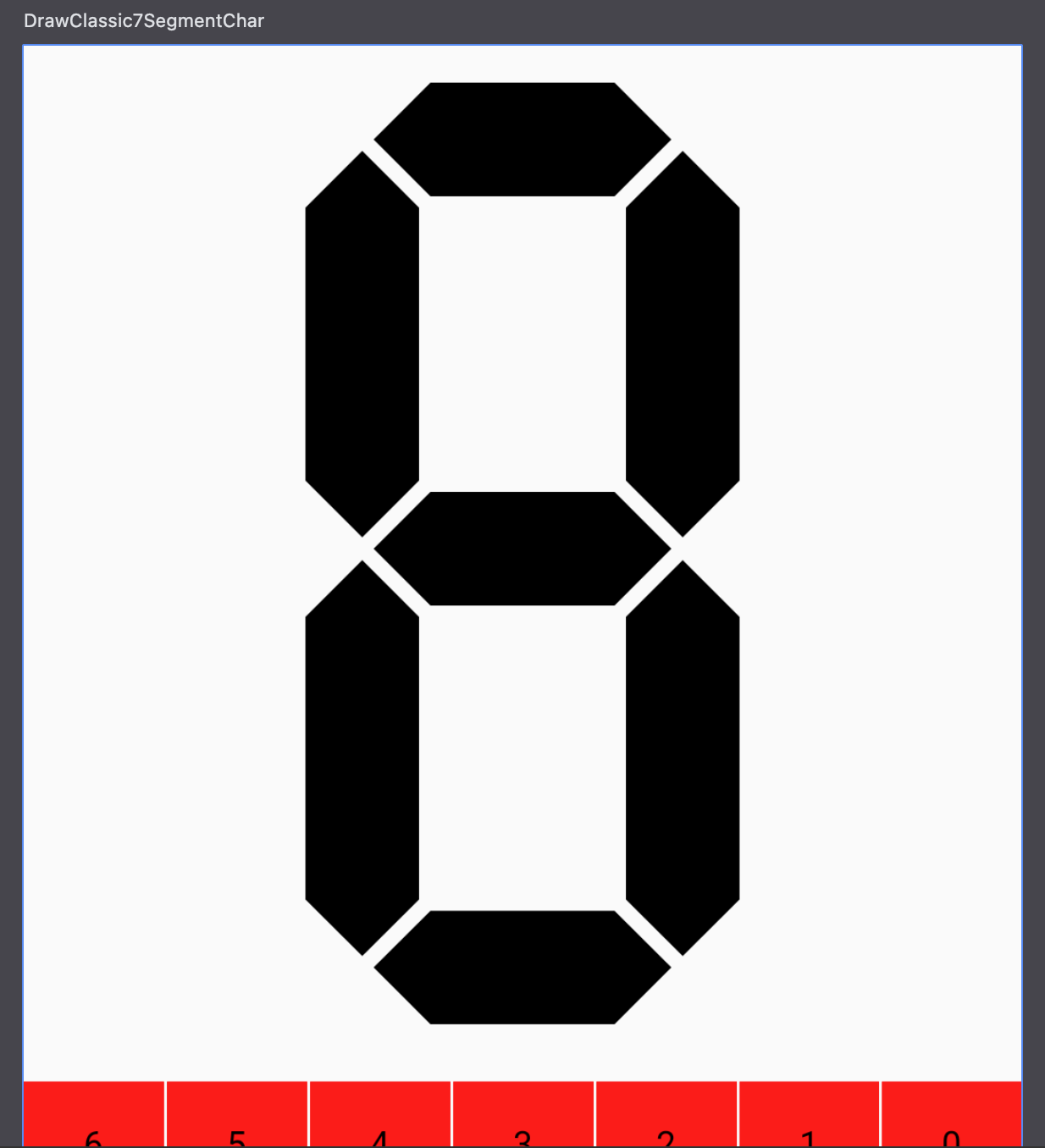
This leads to a very nice looking, even design with gaps:
Gaps on Asymmetric Segments
The problem with the naive approach to adding the gaps is that it doesn't work for asymmetric segments. For example:
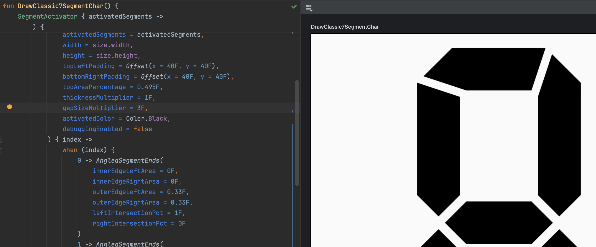
The way we achieved this preview was to pass in the following function that creates the AngledSegmentEnds:
drawClassic7SegmentChar(
    origin = Offset(x = 0F, y = 0F),
    activatedSegments = activatedSegments,
    width = size.width,
    height = size.height,
    topLeftPadding = Offset(x = 40F, y = 40F),
    bottomRightPadding = Offset(x = 40F, y = 40F),
    topAreaPercentage = 0.495F,
    thicknessMultiplier = 1F,
    gapSizeMultiplier = 2F,
    activatedColor = Color.Black,
    debuggingEnabled = true
) { index ->
    when (index) {
        0 -> AngledSegmentEnds(         // top horizontal segment
            innerEdgeLeftArea = 0F,
            innerEdgeRightArea = 0F,
            outerEdgeLeftArea = 0.33F,
            outerEdgeRightArea = 0.33F,
            leftIntersectionPct = 1F,
            rightIntersectionPct = 0F
        )
        1 -> AngledSegmentEnds(         // top-left vertical segment
            innerEdgeLeftArea = 0F,
            innerEdgeRightArea = 0F,
            outerEdgeLeftArea = 0F,
            outerEdgeRightArea = 0.33F,
            leftIntersectionPct = 0.5F,
            rightIntersectionPct = 0F
        )
        2 -> AngledSegmentEnds(         // top-right vertical segment
            innerEdgeLeftArea = 0F,
            innerEdgeRightArea = 0F,
            outerEdgeLeftArea = 0.33F,
            outerEdgeRightArea = 0F,
            leftIntersectionPct = 1F,
            rightIntersectionPct = 0.5F
        )
        3 -> AngledSegmentEnds(         // middle horizontal segment
            innerEdgeLeftArea = 0F,
            innerEdgeRightArea = 0F,
            outerEdgeLeftArea = 0F,
            outerEdgeRightArea = 0F,
            leftIntersectionPct = 0.5F,
            rightIntersectionPct = 0.5F
        )
        4 -> AngledSegmentEnds(         // bottom-left vertical segment
            innerEdgeLeftArea = 0F,
            innerEdgeRightArea = 0F,
            outerEdgeLeftArea = 0.33F,
            outerEdgeRightArea = 0F,
            leftIntersectionPct = 0F,
            rightIntersectionPct = 0.5F
        )
        5 -> AngledSegmentEnds(         // bottom-right vertical segment
            innerEdgeLeftArea = 0F,
            innerEdgeRightArea = 0F,
            outerEdgeLeftArea = 0F,
            outerEdgeRightArea = 0.33F,
            leftIntersectionPct = 0.5F,
            rightIntersectionPct = 1F
        )
        6 -> AngledSegmentEnds(
            innerEdgeLeftArea = 0F,
            innerEdgeRightArea = 0F,
            outerEdgeLeftArea = 0.33F,
            outerEdgeRightArea = 0.33F,
            leftIntersectionPct = 1F,
            rightIntersectionPct = 0F
        )
        else -> error("Invalid segment index: $index")
    }
}
Notice that applying the gaps evenly makes the top horizontal segment not go far enough to the left and the topRight vertical segment too short. Going back to how we designed the interface for specifying the segment ends, we have a leftIntersectionPct and a rightIntersectionPct. These are very convenient because they allow us to make the offset of each point relative to the left/right intersection pct. If the intersection pct is 1, then the offset should be 0 (meaning this segment end takes none of the gap), and if the intersection pct is 0, then the offset should be the full gap size. Therefore, we actually need to multiply the gap size by (1 - intersection pct) to get the correct offset.
Let's start by creating some extension functions on AngledSegmentEnds the correct offsets for us:
private fun AngledSegmentEnds.horizLeftGapOffset(gapSize: Float): Float = gapSize * (1 - leftIntersectionPct)
private fun AngledSegmentEnds.horizRightGapOffset(gapSize: Float): Float = gapSize * (1 - rightIntersectionPct)
private fun AngledSegmentEnds.leftVertTopGapOffset(gapSize: Float): Float = gapSize * (1 - rightIntersectionPct)
private fun AngledSegmentEnds.leftVertBottomGapOffset(gapSize: Float): Float = gapSize * (1 - leftIntersectionPct)
private fun AngledSegmentEnds.rightVertTopGapOffset(gapSize: Float): Float = gapSize * (1 - leftIntersectionPct)
private fun AngledSegmentEnds.rightVertBottomGapOffset(gapSize: Float): Float = gapSize * (1 - rightIntersectionPct)
Now we'll use these functions to calculate the correct gap offsets and apply them to the segments. I'll show the code for the top horizontal segment and top-left vertical segment, leaving the others for brevity:
// top horizontal segment
drawPath(
    color = if (activatedSegments and 0b1 != 0) activatedColor else deactivatedColor,
    path = Path().apply {
        val topHorizontalSegmentBottomY = topY + thickness
        val leftGapOffset = topHorizontalEnds.horizLeftGapOffset(gapSize)
        val rightGapOffset = topHorizontalEnds.horizRightGapOffset(gapSize)

        moveTo(x = topHorizontalOuterEdgeLeftX + leftGapOffset, y = topY)
        lineTo(x = topHorizontalOuterEdgeRightX - rightGapOffset, y = topY)

        val remainingRightEndArea = rightmostX - topHorizontalOuterEdgeRightX
        val rightIntermediateX = topHorizontalOuterEdgeRightX + topHorizontalEnds.rightIntersectionPct * remainingRightEndArea
        val rightIntermediateY = topY + topRightCornerSlope * (rightIntermediateX - topHorizontalOuterEdgeRightX)
        lineTo(x = rightIntermediateX - rightGapOffset, y = rightIntermediateY)
        lineTo(x = topHorizontalEnds.horizInnerEdgeRightX(baseX = baseHorizontalSegmentRightX, thickness) - rightGapOffset, y = topHorizontalSegmentBottomY)
        lineTo(x = topHorizontalEnds.horizInnerEdgeLeftX(baseX = baseHorizontalSegmentLeftX, thickness) + leftGapOffset, y = topHorizontalSegmentBottomY)

        val remainingLeftEndArea = topHorizontalOuterEdgeLeftX - leftmostX
        val leftIntermediateX = topHorizontalOuterEdgeLeftX - topHorizontalEnds.leftIntersectionPct * remainingLeftEndArea
        val leftIntermediateY = topY - topLeftCornerSlope * (topHorizontalOuterEdgeLeftX - leftIntermediateX)
        lineTo(x = leftIntermediateX + leftGapOffset, y = leftIntermediateY)
        close()
    }
)
// top-left vertical segment
drawPath(
    color = if (activatedSegments and 0b10 != 0) activatedColor else deactivatedColor,
    path = Path().apply {
        val topGapOffset = topLeftVerticalEnds.leftVertTopGapOffset(gapSize)
        val bottomGapOffset = topLeftVerticalEnds.leftVertBottomGapOffset(gapSize)
        moveTo(x = leftmostX, y = topLeftVerticalOuterEdgeTopY + topGapOffset)

        val remainingTopEndArea = topLeftVerticalOuterEdgeTopY - topY
        val topIntermediateY = topLeftVerticalOuterEdgeTopY - topLeftVerticalEnds.rightIntersectionPct * remainingTopEndArea
        val topIntermediateX = leftmostX + 1 / topLeftCornerSlope * (topIntermediateY - topLeftVerticalOuterEdgeTopY)
        lineTo(x = topIntermediateX, y = topIntermediateY + topGapOffset)
        lineTo(x = leftVerticalSegmentRightX, y = topLeftVerticalEnds.leftVertInnerEdgeTopY(baseY = baseTopVerticalSegmentTopY, thickness) + topGapOffset)
        lineTo(x = leftVerticalSegmentRightX, y = topLeftVerticalEnds.leftVertInnerEdgeBottomY(baseY = baseTopVerticalSegmentBottomY, thickness) - bottomGapOffset)

        val remainingBottomEndArea = middleHorizontalSegmentBottomY - topLeftVerticalOuterEdgeBottomY
        val bottomIntermediateY = topLeftVerticalOuterEdgeBottomY + topLeftVerticalEnds.leftIntersectionPct * remainingBottomEndArea
        val bottomIntermediateX = leftmostX + 1 / middleLeftUpperToLowerSlope * (bottomIntermediateY - topLeftVerticalOuterEdgeBottomY)
        lineTo(x = bottomIntermediateX, y = bottomIntermediateY - bottomGapOffset)
        lineTo(x = leftmostX, y = topLeftVerticalOuterEdgeBottomY - bottomGapOffset)
        close()
    }
)
After you're done, check that your preview matches:
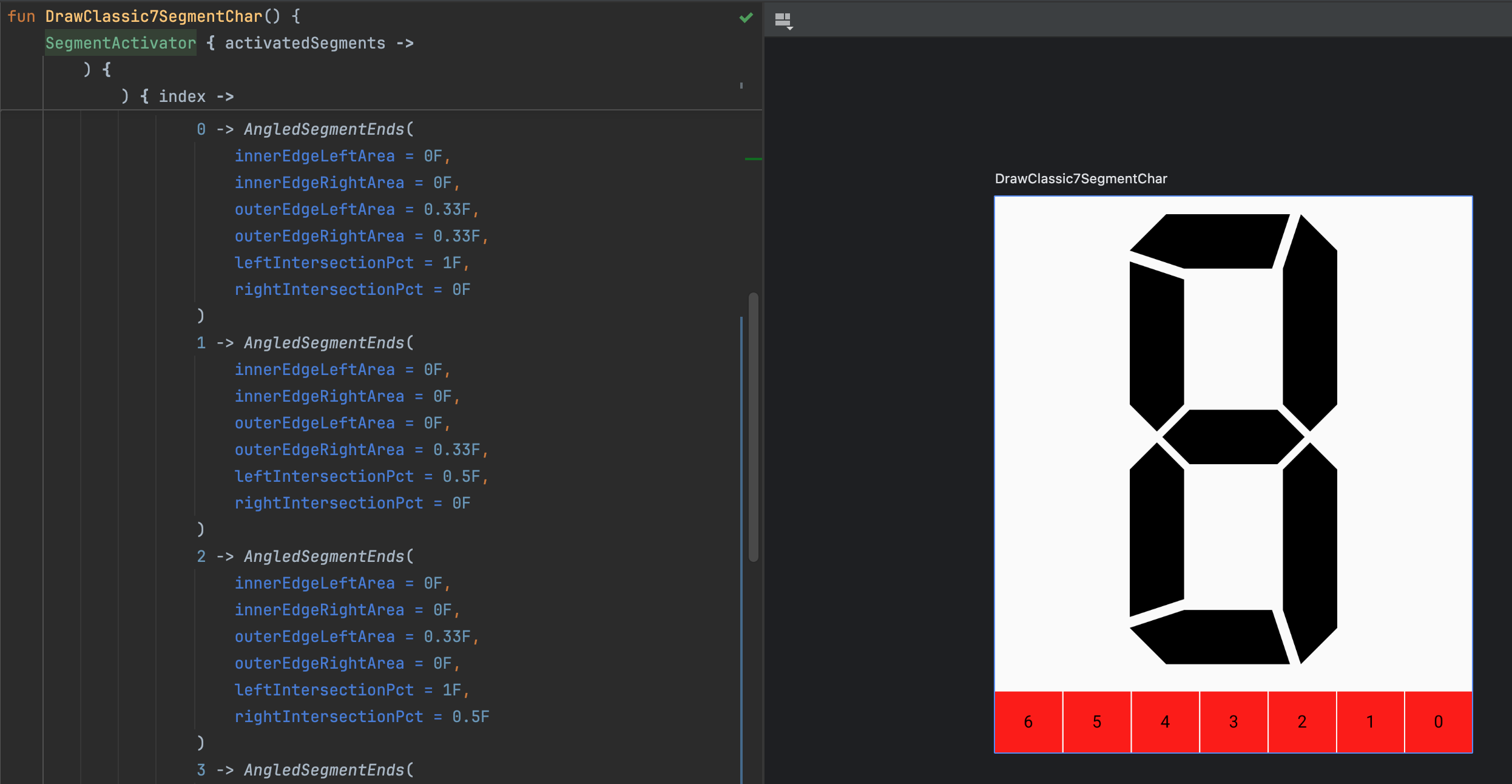
Functions to supply angled segment ends
Now that we have the gaps working for asymmetric segments, we can create some preset functions for supplying the AngledSegmentEnds for the segments. Our planning section shows that we have three types of segments: even, symmetric, and asymmetric. Because we designed the signature of our drawClassic7SegmentChar function to take a function with an index argument and returns the AngledSegmentEnds for the segment at that index, for each preset, we'll create a function that returns the function matching that signature.
If you're used to imperative programming instead of functional programming, the idea of writing a function that returns a function may be foreign or seem unnatural. This is a functional programming concept called "higher-order functions." The primary reason we're using a higher-order function in this case is to curry the function that produces the AngledSegmentEnds for a segment. This approach allows us to enclose the AngledSegmentEnds objects, creating them once, then reference them later by index. It also provides the flexibility of delaying instantiation of the AngledSegmentEnds objects until they are needed (which is not necessary in this case, but could be in other cases).
Many other approaches to accessing an AngledSegmentEnds instance by index will work. You could use a Map<Int, AngledSegmentEnds> or merely an Array<AngledSegmentEnds>, instead of a (Int) -> AngledSegmentEnds function. However, the function is the most open for extension while remaining closed for modification. This is a principle of SOLID design, specifically the Open/Closed Principle.
Preset for Even Segments
This is the easiest preset to implement because the segments are completely even and symmetric. Because this function returns the same AngledSegmentEnds object for all indices, and because we've created this object already (AngledSegmentEnds.EVEN), we can create a shortcut for this that allows us to use a method reference instead of creating a function object. Here's the code:
fun symmetricEvenAngledSegmentEnds(index: Int): AngledSegmentEnds = AngledSegmentEnds.EVEN
Preset for Symmetric Segments
Supposing the outer edges do not extend into the end area, this function degenerates into the symmetricEvenAngledSegmentEnds function, so we'll account for that by redirecting to it using a method reference. However, Posy's designs have the outer edges of the segments extending into the end area. Here's the code for the symmetric segments:
fun createSymmetricAngled7SegmentEndsFun(outerEdgeArea: Float = 0.33F): (Int) -> AngledSegmentEnds {
    if (outerEdgeArea == 0F) {
        return ::symmetricEvenAngledSegmentEnds
    }

    val topBottomHorizontal = AngledSegmentEnds(
        innerEdgeLeftArea = 0F,
        innerEdgeRightArea = 0F,
        outerEdgeLeftArea = outerEdgeArea,
        outerEdgeRightArea = outerEdgeArea,
        leftIntersectionPct = 0.5F,
        rightIntersectionPct = 0.5F
    )
    val topLeftBottomRightVertical = AngledSegmentEnds(
        innerEdgeLeftArea = 0F,
        innerEdgeRightArea = 0F,
        outerEdgeLeftArea = 0F,
        outerEdgeRightArea = outerEdgeArea,
        leftIntersectionPct = 0.5F,
        rightIntersectionPct = 0.5F
    )
    val topRightBottomLeftVertical = AngledSegmentEnds(
        innerEdgeLeftArea = 0F,
        innerEdgeRightArea = 0F,
        outerEdgeLeftArea = outerEdgeArea,
        outerEdgeRightArea = 0F,
        leftIntersectionPct = 0.5F,
        rightIntersectionPct = 0.5F
    )
    return { index ->
        when (index) {
            0, 6 -> topBottomHorizontal
            1, 5 -> topLeftBottomRightVertical
            2, 4 -> topRightBottomLeftVertical
            else -> AngledSegmentEnds.EVEN
        }
    }
}
Preset for Asymmetric Segments
The preset for the asymmetric segments actually comes from the preview we used earlier to demonstrate why the naive approach to adding gaps doesn't work. However, we can parameterize and precalculate the AngledSegmentEnds. Here's the code:
fun createAsymmetricAngled7SegmentEndsFun(
    outerEdgeArea: Float = 0.33F,
    extremeIntersectionPct: Float = 1F
): (Int) -> AngledSegmentEnds {
    val topBottomHorizontal = AngledSegmentEnds(
        innerEdgeLeftArea = 0F,
        innerEdgeRightArea = 0F,
        outerEdgeLeftArea = outerEdgeArea,
        outerEdgeRightArea = outerEdgeArea,
        leftIntersectionPct = extremeIntersectionPct,
        rightIntersectionPct = 1 - extremeIntersectionPct
    )
    val topLeftVertical = AngledSegmentEnds(
        innerEdgeLeftArea = 0F,
        innerEdgeRightArea = 0F,
        outerEdgeLeftArea = 0F,
        outerEdgeRightArea = outerEdgeArea,
        leftIntersectionPct = 0.5F,
        rightIntersectionPct = 1 - extremeIntersectionPct
    )
    val topRightVertical = AngledSegmentEnds(
        innerEdgeLeftArea = 0F,
        innerEdgeRightArea = 0F,
        outerEdgeLeftArea = outerEdgeArea,
        outerEdgeRightArea = 0F,
        leftIntersectionPct = extremeIntersectionPct,
        rightIntersectionPct = 0.5F
    )
    val bottomLeftVertical = AngledSegmentEnds(
        innerEdgeLeftArea = 0F,
        innerEdgeRightArea = 0F,
        outerEdgeLeftArea = outerEdgeArea,
        outerEdgeRightArea = 0F,
        leftIntersectionPct = 1 - extremeIntersectionPct,
        rightIntersectionPct = 0.5F
    )
    val bottomRightVertical = AngledSegmentEnds(
        innerEdgeLeftArea = 0F,
        innerEdgeRightArea = 0F,
        outerEdgeLeftArea = 0F,
        outerEdgeRightArea = outerEdgeArea,
        leftIntersectionPct = 0.5F,
        rightIntersectionPct = extremeIntersectionPct
    )
    return { index ->
        when (index) {
            0, 6 -> topBottomHorizontal
            1 -> topLeftVertical
            2 -> topRightVertical
            4 -> bottomLeftVertical
            5 -> bottomRightVertical
            else -> AngledSegmentEnds.EVEN
        }
    }
}
Testing the presets
We can now check that our presets work properly. Let's update our compose previews to use these presets. Here's the full Classic7SegmentDisplayPreview.kt file:
package com.fsryan.ui.segments

import androidx.compose.foundation.Canvas
import androidx.compose.foundation.layout.height
import androidx.compose.foundation.layout.width
import androidx.compose.runtime.Composable
import androidx.compose.ui.Modifier
import androidx.compose.ui.geometry.Offset
import androidx.compose.ui.graphics.Color
import androidx.compose.ui.tooling.preview.Preview
import androidx.compose.ui.unit.dp

@Composable
@Preview(showBackground = true)
fun DrawClassic7SegmentEvenChar() {
    SegmentActivator { activatedSegments ->
        Canvas(
            modifier = Modifier
                .width(200.dp)
                .height(400.dp)
        ) {
            drawClassic7SegmentChar(
                origin = Offset(x = 0F, y = 0F),
                activatedSegments = activatedSegments,
                width = size.width,
                height = size.height,
                topLeftPadding = Offset(x = 40F, y = 40F),
                bottomRightPadding = Offset(x = 40F, y = 40F),
                topAreaPercentage = 0.495F,
                thicknessMultiplier = 1F,
                gapSizeMultiplier = 2F,
                activatedColor = Color.Black,
                debuggingEnabled = true,
                angledSegmentEndsOf = ::symmetricEvenAngledSegmentEnds
            )
        }
    }
}

@Composable
@Preview(showBackground = true)
fun DrawClassic7SegmentSymmetricChar() {
    SegmentActivator { activatedSegments ->
        Canvas(
            modifier = Modifier
                .width(200.dp)
                .height(400.dp)
        ) {
            drawClassic7SegmentChar(
                origin = Offset(x = 0F, y = 0F),
                activatedSegments = activatedSegments,
                width = size.width,
                height = size.height,
                topLeftPadding = Offset(x = 40F, y = 40F),
                bottomRightPadding = Offset(x = 40F, y = 40F),
                topAreaPercentage = 0.495F,
                thicknessMultiplier = 1F,
                gapSizeMultiplier = 2F,
                activatedColor = Color.Black,
                debuggingEnabled = true,
                angledSegmentEndsOf = createSymmetricAngled7SegmentEndsFun()
            )
        }
    }
}

@Composable
@Preview(showBackground = true)
fun DrawClassic7SegmentAsymmetricChar() {
    SegmentActivator { activatedSegments ->
        Canvas(
            modifier = Modifier
                .width(200.dp)
                .height(400.dp)
        ) {
            drawClassic7SegmentChar(
                origin = Offset(x = 0F, y = 0F),
                activatedSegments = activatedSegments,
                width = size.width,
                height = size.height,
                topLeftPadding = Offset(x = 40F, y = 40F),
                bottomRightPadding = Offset(x = 40F, y = 40F),
                topAreaPercentage = 0.495F,
                thicknessMultiplier = 1F,
                gapSizeMultiplier = 2F,
                activatedColor = Color.Black,
                debuggingEnabled = true,
                angledSegmentEndsOf = createAsymmetricAngled7SegmentEndsFun()
            )
        }
    }
}
When you check this, mess around with things like topAreaPercentage, thicknessMultiplier and gapSizeMultiplier to see how the segments change.
Classic 7 Segment Display Composable
Now that we've tested our DrawScope.drawClassic7SegmentChar function, we can wrap this in a composable, just like we did with the Rect7SegmentDisplay composable. Here's the code for the Classic7SegmentDisplay composable:
@Composable
fun Classic7SegmentDisplay(
    modifier: Modifier = Modifier,
    text: String,
    paddingValues: PaddingValues = PaddingValues(4.dp),
    topAreaPercentage: Float = 0.495F,
    thicknessMultiplier: Float = 1F,
    gapSizeMultiplier: Float = 1F,
    activatedColor: Color = Color.Black,
    deactivatedColor: Color = activatedColor.copy(alpha = 0.05F),
    angledSegmentEndsOf: (Int) -> AngledSegmentEnds = ::symmetricEvenAngledSegmentEnds,
    charToActivatedSegments: (Char) -> Int = ::transformCharToActiveSegments
) {
    val density = LocalDensity.current.density
    val layoutDirection = LocalLayoutDirection.current
    val topLeftPadding = Offset(
        x = paddingValues.calculateLeftPadding(layoutDirection).value * density,
        y = paddingValues.calculateTopPadding().value * density
    )
    val bottomRightPadding = Offset(
        x = paddingValues.calculateRightPadding(layoutDirection).value * density,
        y = paddingValues.calculateBottomPadding().value * density
    )
    SingleLineSegmentedDisplay(modifier = modifier, text = text) { _, char, origin, charWidth, charHeight ->
        drawClassic7SegmentChar(
            activatedSegments = charToActivatedSegments(char),
            origin = origin,
            width = charWidth,
            height = charHeight,
            gapSizeMultiplier = gapSizeMultiplier,
            topLeftPadding = topLeftPadding,
            topAreaPercentage = topAreaPercentage,
            bottomRightPadding = bottomRightPadding,
            thicknessMultiplier = thicknessMultiplier,
            activatedColor = activatedColor,
            deactivatedColor = deactivatedColor,
            debuggingEnabled = false,
            angledSegmentEndsOf = angledSegmentEndsOf
        )
    }
}
Now, lets test this by adding a few new composable previews to the Classic7SegmentDisplayPreview.kt file:
@Preview(widthDp = 800)
@Composable
fun Classic7SegmentEvenHexCharacters() {
    Column {
        Classic7SegmentDisplay(
            modifier = Modifier
                .background(Color.LightGray)
                .width(800.dp)
                .height(200.dp),
            text = "01234567",
            thicknessMultiplier = 1.2F,
            gapSizeMultiplier = 2F,
            activatedColor = Color.Black
        )
        Classic7SegmentDisplay(
            modifier = Modifier
                .background(Color.LightGray)
                .width(800.dp)
                .height(200.dp),
            thicknessMultiplier = 1.2F,
            gapSizeMultiplier = 2F,
            text = "89ABCDEF",
            activatedColor = Color.Black
        )
    }
}

@Preview(widthDp = 800)
@Composable
fun Classic7SegmentSymmetricHexCharacters() {
    val angledSegmentEnds = createSymmetricAngled7SegmentEndsFun(0.5F)
    Column {
        Classic7SegmentDisplay(
            modifier = Modifier
                .background(Color.LightGray)
                .width(800.dp)
                .height(200.dp),
            text = "01234567",
            thicknessMultiplier = 1.2F,
            gapSizeMultiplier = 2F,
            activatedColor = Color.Black,
            angledSegmentEndsOf = angledSegmentEnds
        )
        Classic7SegmentDisplay(
            modifier = Modifier
                .background(Color.LightGray)
                .width(800.dp)
                .height(200.dp),
            thicknessMultiplier = 1.2F,
            gapSizeMultiplier = 2F,
            text = "89ABCDEF",
            activatedColor = Color.Black,
            angledSegmentEndsOf = angledSegmentEnds
        )
    }
}

@Preview(widthDp = 800)
@Composable
fun Classic7SegmentAsymmetricHexCharacters() {
    val angledSegmentEnds = createAsymmetricAngled7SegmentEndsFun()
    Column {
        Classic7SegmentDisplay(
            modifier = Modifier
                .background(Color.LightGray)
                .width(800.dp)
                .height(200.dp),
            text = "01234567",
            thicknessMultiplier = 1.25F,
            gapSizeMultiplier = 1F,
            activatedColor = Color.Black,
            angledSegmentEndsOf = angledSegmentEnds
        )
        Classic7SegmentDisplay(
            modifier = Modifier
                .background(Color.LightGray)
                .width(800.dp)
                .height(200.dp),
            thicknessMultiplier = 1.25F,
            gapSizeMultiplier = 1F,
            text = "89ABCDEF",
            activatedColor = Color.Black,
            angledSegmentEndsOf = angledSegmentEnds
        )
    }
}
When you've added the preview, it should look like this:
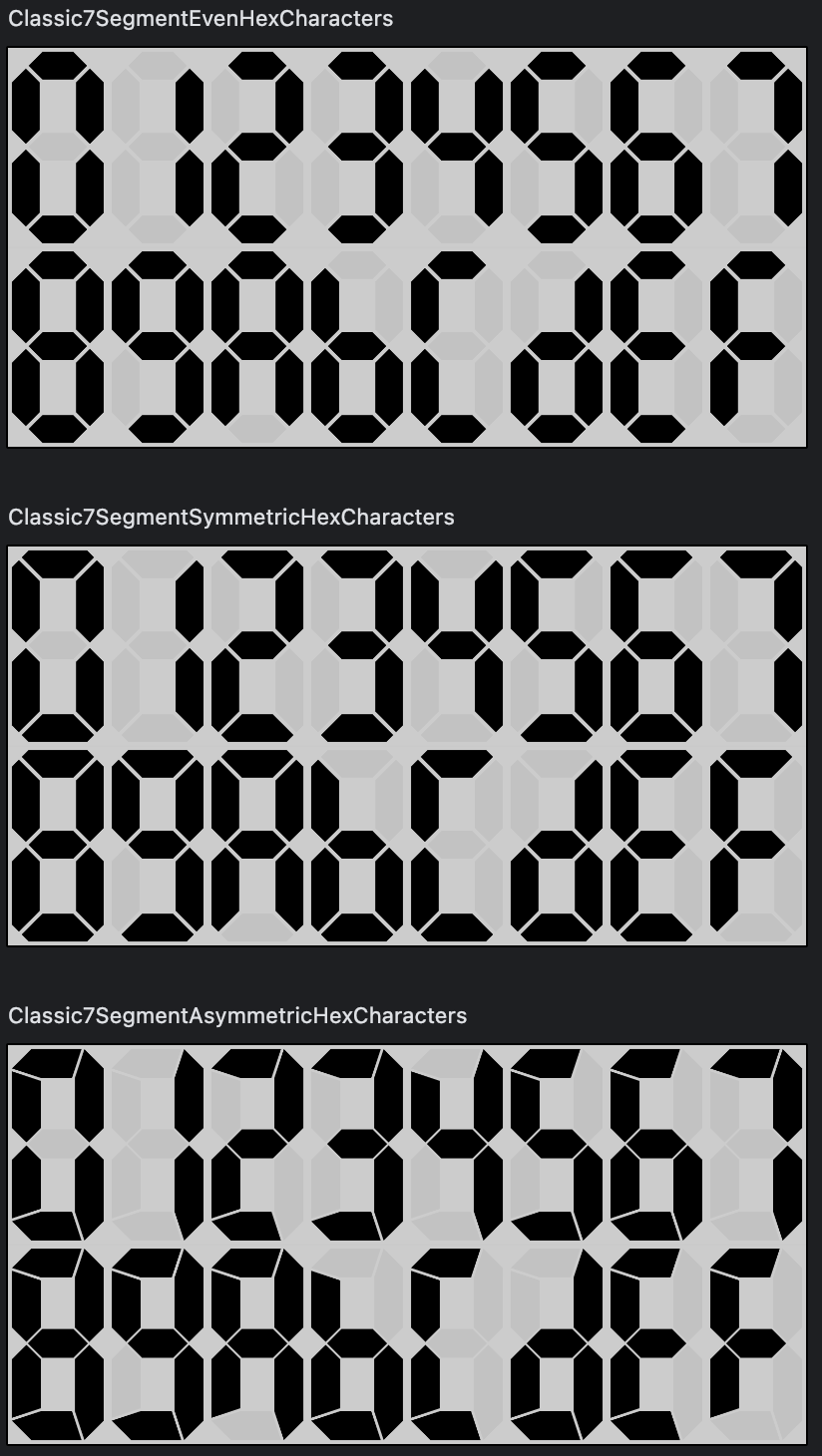
Adding example code to the sample app
Now we should demo what we've already done by updating the composeApp app. This demo is more involved than the previous demo because there are more styleable properties to modify.
This app is not about looking visually appealing and flashy--and there could be bugs. That's not really the important part of the app. It's about demonstrating the functionality of the segmented display library.
Some housekeeping to the composeApp
First, lets get rid of the enter/exit animation, as it's kind of a bother. Open the composeApp/src/commonMain/kotlin/App.kt file and change it to the below:
import androidx.compose.foundation.background
import androidx.compose.foundation.layout.BoxWithConstraints
import androidx.compose.foundation.layout.Column
import androidx.compose.foundation.layout.fillMaxSize
import androidx.compose.foundation.layout.fillMaxWidth
import androidx.compose.foundation.layout.height
import androidx.compose.material.MaterialTheme
import androidx.compose.runtime.*
import androidx.compose.ui.Alignment
import androidx.compose.ui.Modifier
import androidx.compose.ui.graphics.Color
import com.fsryan.ui.segments.Rect7SegmentDisplay
import org.jetbrains.compose.ui.tooling.preview.Preview

@Composable
@Preview
fun App() {
    MaterialTheme {
        Column(
            Modifier.fillMaxSize(),
            horizontalAlignment = Alignment.CenterHorizontally
        ) {
            BoxWithConstraints(modifier = Modifier.fillMaxWidth()) {
                val width = maxWidth
                Column(
                    modifier = Modifier.fillMaxWidth(),
                    horizontalAlignment = Alignment.CenterHorizontally
                ) {
                    Rect7SegmentDisplay(
                        modifier = Modifier.background(Color.LightGray)
                            .fillMaxWidth()
                            .height(width / 4), // <-- aspect ratio of each character is 1:2
                        text = "01234567",
                        thicknessMultiplier = 0.6F,
                        gapSizeMultiplier = 0.75F,
                        activatedColor = Color.Red
                    )
                    Rect7SegmentDisplay(
                        modifier = Modifier.background(Color.LightGray)
                            .fillMaxWidth()
                            .height(width / 4), // <-- aspect ratio of each character is 1:2
                        thicknessMultiplier = 0.6F,
                        gapSizeMultiplier = 0.75F,
                        text = "89ABCDEF",
                        activatedColor = Color.Red
                    )
                }
            }
        }
    }
}
This will remove entry/exit button and animation that was there before by default.
Next, lets change our compose material dependency to compose.material3. We'll use this later. In composeApp/build.gradle.kts, update implementation(compose.material) to implementation(compose.material3).
When you do this, you'll need to change the import androidx.compose.material.MaterialTheme line in App.kt to import androidx.compose.material3.MaterialTheme.
Demo App ShowDisplays function
Next, lets create a new ShowDisplays composable function that will take in state for our different configurable properties:
@Composable
fun ShowDisplays(
    modifier: Modifier = Modifier,
    charWidth: Dp,
    charHeight: Dp,
    gapSizeMultiplier: Float,
    hexagonalSegmentParams: (index: Int, leftTop: Boolean) -> HexagonalSegmentParams,
    shearPct: Float,
    activatedColor: Color,
    thicknessMultiplier: Float,
    topHeightPercentage: Float,
    drawDebugLines: Boolean
) {
    Column(
        modifier = modifier.fillMaxWidth()
            .verticalScroll(rememberScrollState()),
        horizontalAlignment = Alignment.CenterHorizontally
    ) {
        Box(
            modifier = Modifier.width(8 * charWidth)
                .height(charHeight)
        ) {
            Hexagonal7SegmentDisplay(
                text = "01234567",
                activatedColor = activatedColor,
                gapSizeMultiplier = gapSizeMultiplier,
                hexagonalSegmentParams = hexagonalSegmentParams,
                shearPct = shearPct,
                thicknessMultiplier = thicknessMultiplier,
                topHeightPercentage = topHeightPercentage,
                debuggingEnabled = drawDebugLines
            )
        }
        Box(
            modifier = Modifier.width(8 * charWidth)
                .height(charHeight)
        ) {
            Hexagonal7SegmentDisplay(
                text = "89ABCDEF",
                activatedColor = activatedColor,
                gapSizeMultiplier = gapSizeMultiplier,
                hexagonalSegmentParams = hexagonalSegmentParams,
                shearPct = shearPct,
                thicknessMultiplier = thicknessMultiplier,
                topHeightPercentage = topHeightPercentage,
                debuggingEnabled = drawDebugLines
            )
        }
    }
}
Let's now use the ShowDisplays function in the App composable, creating some state that we'll use later:
@Composable
@Preview
fun App() {
    MaterialTheme {
        Column(
            Modifier.fillMaxSize(),
            horizontalAlignment = Alignment.CenterHorizontally
        ) {
            val debuggingEnabledState = remember { mutableStateOf(false) }
            val angledSegmentEndsFunState = remember {
                mutableStateOf("Classic Symmetric" to createSymmetricAngled7SegmentEndsFun())
            }
            val thicknessMultiplierState = remember { mutableFloatStateOf(1F) }
            val topAreaPercentageState = remember { mutableFloatStateOf(0.495F) }
            val gapSizeMultiplierState = remember { mutableFloatStateOf(1F) }
            val activatedColorState = remember { mutableStateOf(Color.Red) }
            ShowDisplays(
                modifier = Modifier.weight(2F),
                gapSizeMultiplier = gapSizeMultiplierState.value,
                angledSegmentEnds = angledSegmentEndsFunState.value.second,
                topAreaPercentage = topAreaPercentageState.value,
                activatedColor = activatedColorState.value,
                thicknessMultiplier = thicknessMultiplierState.value,
                debuggingEnabled = debuggingEnabledState.value
            )
        }
    }
}
Creating a control assembly
There are several parts of the state that we can create controls for. In the same App.kt file, add a ControlAssembly composable function with the following signature:
@Composable
fun ControlAssembly(
    modifier: Modifier = Modifier,
    thicknessMultiplierState: MutableFloatState,
    gapSizeMultiplierState: MutableFloatState,
    topAreaPercentageState: MutableFloatState,
    activatedColorState: MutableState<Color>,
    debuggingEnabledState: MutableState<Boolean>,
    angledSegmentEndsFunState: MutableState<Pair<String, (Int) -> AngledSegmentEnds>>
) {
    /* ... */
}
In this function, we'll have a drop-down for the angled segment ends, a slider for the thickness multiplier, a slider for the gap size multiplier, a slider for the top height percentage, and three sliders for the activated colors, and a toggle for whether debugging is enabled. To that end, we will need a FloatValueSliderControl composable function:
@Composable
fun FloatValueSliderControl(
    valueRange: ClosedFloatingPointRange<Float>,
    steps: Int,
    state: MutableFloatState,
    renderLabel: (value: Float) -> String
) {
    Row(
        modifier = Modifier.fillMaxWidth(),
        verticalAlignment = Alignment.CenterVertically,
    ) {
        var label by remember { mutableStateOf(renderLabel(state.value)) }
        Text(modifier = Modifier.weight(1F), text = label)
        Slider(
            modifier = Modifier.weight(3F, fill = true),
            value = state.value,
            valueRange = valueRange,
            onValueChange = { newValue ->
                state.value = newValue
            },
            steps = steps,
            onValueChangeFinished = {
                label = renderLabel(state.value)
            }
        )
    }
}

private fun Float.roundToDecimals(decimals: Int): Float {
    var dotAt = 1
    repeat(decimals) { dotAt *= 10 }
    val roundedValue = (this * dotAt).roundToInt()
    return (roundedValue / dotAt) + (roundedValue % dotAt).toFloat() / dotAt
}
This control has a label as well as a slider, which will be the primary surface of control. For now, lets just focus on controling the topHeightPercentageState with our new FloatValueSliderControl:
@Composable
fun ControlAssembly(
    modifier: Modifier = Modifier,
    thicknessMultiplierState: MutableFloatState,
    gapSizeMultiplierState: MutableFloatState,
    topAreaPercentageState: MutableFloatState,
    activatedColorState: MutableState<Color>,
    debuggingEnabledState: MutableState<Boolean>,
    angledSegmentEndsFunState: MutableState<Pair<String, (Int) -> AngledSegmentEnds>>
) {
    Column(
        modifier = modifier.fillMaxWidth()
            .padding(all = 16.dp),
        verticalArrangement = Arrangement.spacedBy(8.dp)
    ) {
        FloatValueSliderControl(
            valueRange = 0F .. 1F,
            steps = 1000,
            state = topAreaPercentageState
        ) { value ->
            "Top Section: ${value.roundToDecimals(3) * 100}%"
        }
    }
}
We'll add more controls later, but for now, lets add the ControlAssembly to the App composable:
@Composable
@Preview
fun App() {
    MaterialTheme {
        Column(
            Modifier.fillMaxSize(),
            horizontalAlignment = Alignment.CenterHorizontally
        ) {
            val debuggingEnabledState = remember { mutableStateOf(false) }
            val angledSegmentEndsFunState = remember {
                mutableStateOf("Classic Symmetric" to createSymmetricAngled7SegmentEndsFun())
            }
            val thicknessMultiplierState = remember { mutableFloatStateOf(1F) }
            val topAreaPercentageState = remember { mutableFloatStateOf(0.495F) }
            val gapSizeMultiplierState = remember { mutableFloatStateOf(1F) }
            val activatedColorState = remember { mutableStateOf(Color.Red) }
            ShowDisplays(
                modifier = Modifier.weight(2F),
                gapSizeMultiplier = gapSizeMultiplierState.value,
                angledSegmentEnds = angledSegmentEndsFunState.value.second,
                topAreaPercentage = topAreaPercentageState.value,
                activatedColor = activatedColorState.value,
                thicknessMultiplier = thicknessMultiplierState.value,
                debuggingEnabled = debuggingEnabledState.value
            )
            ControlAssembly(
                modifier = Modifier.weight(1F),
                thicknessMultiplierState = thicknessMultiplierState,
                gapSizeMultiplierState = gapSizeMultiplierState,
                topAreaPercentageState = topAreaPercentageState,
                activatedColorState = activatedColorState,
                debuggingEnabledState = debuggingEnabledState,
                angledSegmentEndsFunState = angledSegmentEndsFunState
            )
        }
    }
}
Test your app. If you don't recall how to run it, see the first post in this series.
After this you should be able to adjust the top area's height percentage by dragging around the slider:
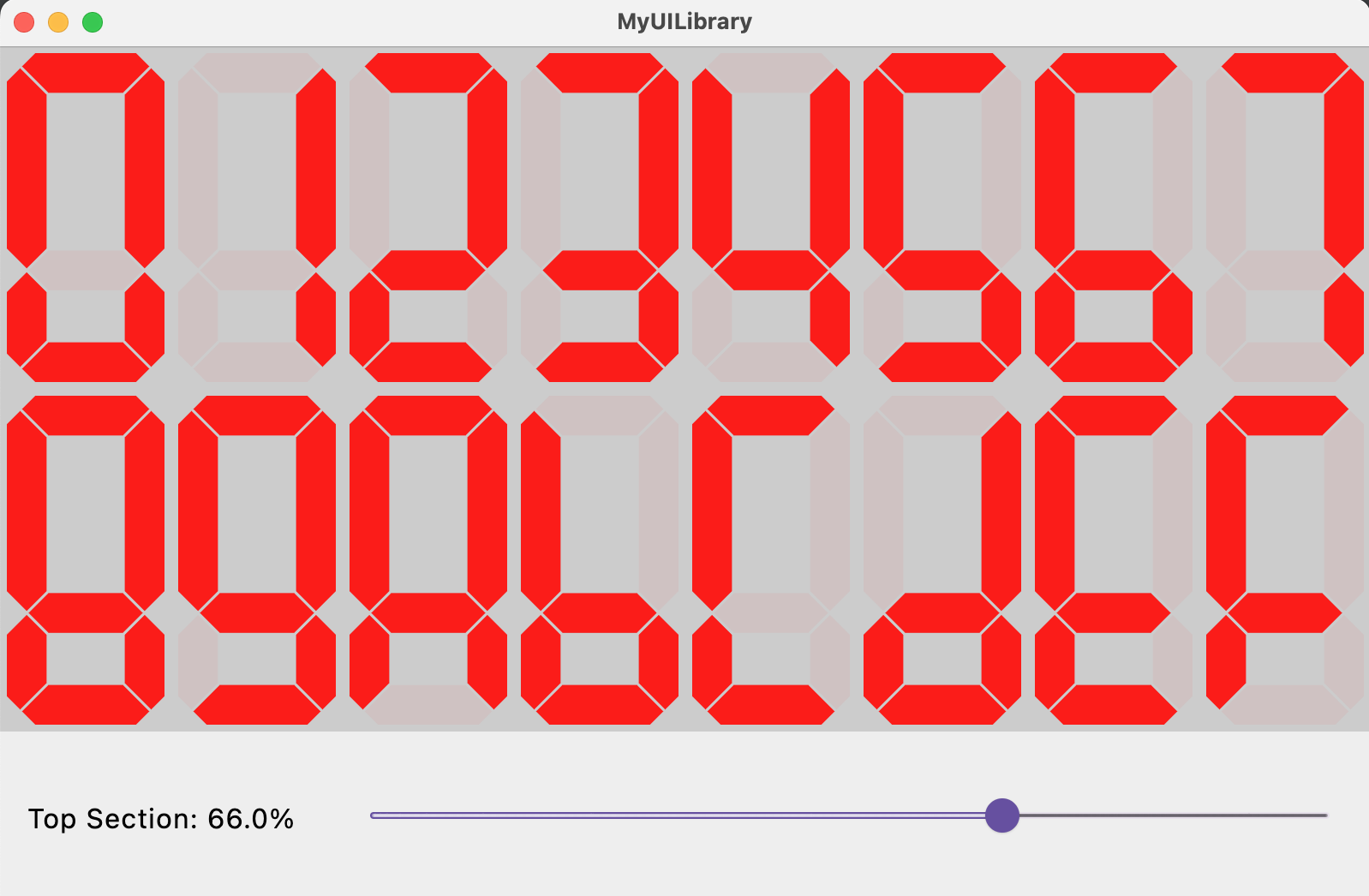
Adding other slider controls
Once you're able to control the top area percentage, you can add the other controls. Let's create a special ColorSliders composable function for housing the color sliders:
@Composable
fun ColorSliders(activatedColorState: MutableState<Color>) {
    val redState = remember { mutableFloatStateOf(activatedColorState.value.red) }
    val greenState = remember { mutableFloatStateOf(activatedColorState.value.green) }
    val blueState = remember { mutableFloatStateOf(activatedColorState.value.blue) }
    Column(
        modifier = Modifier.fillMaxWidth()
            .border(1.dp, MaterialTheme.colorScheme.primary, shape = MaterialTheme.shapes.medium)
            .padding(all = 8.dp)
    ) {
        Text(
            text = "Colors",
            textDecoration = TextDecoration.Underline
        )
        FloatValueSliderControl(
            valueRange = 0F .. 1F,
            steps = 1000,
            state = redState
        ) { value ->
            "Red: ${value.roundToDecimals(3)}"
        }
        FloatValueSliderControl(
            valueRange = 0F .. 1F,
            steps = 1000,
            state = greenState
        ) { value ->
            "Green: ${value.roundToDecimals(3)}"
        }
        FloatValueSliderControl(
            valueRange = 0F .. 1F,
            steps = 1000,
            state = blueState
        ) { value ->
            "Blue: ${value.roundToDecimals(3)}"
        }
    }
    activatedColorState.value = Color(redState.value, greenState.value, blueState.value)
}
Here's the full ControlAssembly function:
@Composable
fun ControlAssembly(
    modifier: Modifier = Modifier,
    thicknessMultiplierState: MutableFloatState,
    gapSizeMultiplierState: MutableFloatState,
    topAreaPercentageState: MutableFloatState,
    activatedColorState: MutableState<Color>,
    debuggingEnabledState: MutableState<Boolean>,
    angledSegmentEndsFunState: MutableState<Pair<String, (Int) -> AngledSegmentEnds>>
) {
    Column(
        modifier = modifier.fillMaxWidth()
            .verticalScroll(rememberScrollState())
            .padding(all = 16.dp),
        verticalArrangement = Arrangement.spacedBy(8.dp)
    ) {
        Row(
            modifier = Modifier.fillMaxWidth(),
            horizontalArrangement = Arrangement.SpaceEvenly
        ) {
            Button(
                onClick = {
                    debuggingEnabledState.value = !debuggingEnabledState.value
                }
            ) {
                Text("Debug Lines: ${if (debuggingEnabledState.value) "ON" else "OFF"}")
            }
            AngledSegmentEndsFunDropDown(angledSegmentEndsFunState)
            Button(
                onClick = {
                    thicknessMultiplierState.value = 1F
                    gapSizeMultiplierState.value = 1F
                    topAreaPercentageState.value = .495F
                    debuggingEnabledState.value = false
                    angledSegmentEndsFunState.value = "Classic Symmetric" to createSymmetricAngled7SegmentEndsFun()
                    activatedColorState.value = Color.Red
                }
            ) {
                Text("Restore Defaults")
            }
        }
        ColorSliders(activatedColorState = activatedColorState)
        FloatValueSliderControl(
            valueRange = 0F .. 1F,
            steps = 1000,
            state = topAreaPercentageState
        ) { value ->
            "Top Section: ${value.roundToDecimals(3) * 100}%"
        }
        FloatValueSliderControl(
            valueRange = 0F .. 2F,
            steps = 2000,
            state = thicknessMultiplierState
        ) { value ->
            "Thickness Multiplier: ${value.roundToDecimals(3)}"
        }
        FloatValueSliderControl(
            valueRange = 0F .. 10F,
            steps = 1000,
            state = gapSizeMultiplierState
        ) { value ->
            "Gap Size Multiplier: ${value.roundToDecimals(3)}"
        }
    }
}
Now you should check that you can control the thickness multiplier, gap size multiplier, and the activated color:
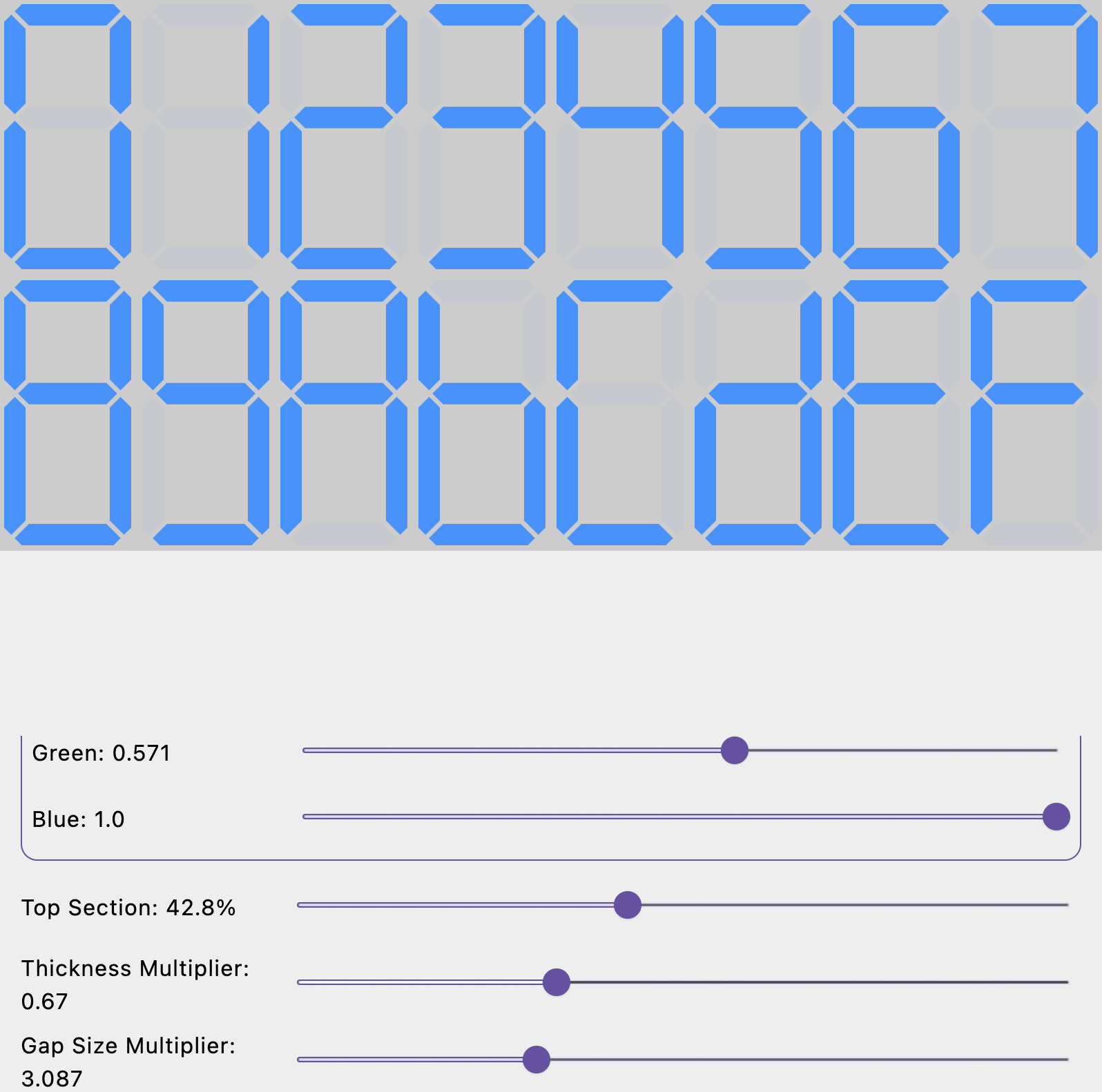
Adding the rest of the controls
Now we need to add a control for the debug toggle and function that creates the angled segment ends. Now make a control for selecting the function that returns the AngledSegmentEnds:
@OptIn(ExperimentalMaterial3Api::class)
@Composable
fun AngledSegmentEndsFunDropDown(
    angledSegmentEndsState: MutableState<Pair<String, (Int) -> AngledSegmentEnds>>
) {
    var isExpanded by remember { mutableStateOf(false) }
    ExposedDropdownMenuBox(
        modifier = Modifier,
        expanded = isExpanded,
        onExpandedChange = { newValue ->
            isExpanded = newValue
        }
    ) {
        TextField(
            modifier = Modifier.menuAnchor(),
            value = hexagonalSegmentParamsState.value.first,
            onValueChange = {},
            readOnly = true,
            trailingIcon = {
                ExposedDropdownMenuDefaults.TrailingIcon(isExpanded)
            },
            colors = ExposedDropdownMenuDefaults.textFieldColors()
        )
        ExposedDropdownMenu(
            expanded = isExpanded,
            onDismissRequest = {
                isExpanded = false
            }
        ) {
            sequenceOf(
                "Classic Symmetric Uneven" to HexagonalSegmentParams.classic7SymmetricParamsFun(),
                "Classic Symmetric Even" to HexagonalSegmentParams.evenFun(),
                "Classic Asymmetric" to HexagonalSegmentParams.classic7AsymmetricParamsFun()
            ).forEach { pair ->
                DropdownMenuItem(
                    text = {
                        Text(pair.first)
                    },
                    onClick = {
                        isExpanded = false
                        hexagonalSegmentParamsState.value = pair
                    }
                )
            }
        }
    }
}
We'll put this dropdown on the same row as the toggle button for the debug lines as well as a reset button:
@Composable
fun ControlAssembly(
    modifier: Modifier = Modifier,
    thicknessMultiplierState: MutableFloatState,
    gapSizeMultiplierState: MutableFloatState,
    topAreaPercentageState: MutableFloatState,
    activatedColorState: MutableState<Color>,
    debuggingEnabledState: MutableState<Boolean>,
    angledSegmentEndsFunState: MutableState<Pair<String, (Int) -> AngledSegmentEnds>>
) {
    Column(
        modifier = modifier.fillMaxWidth()
            .verticalScroll(rememberScrollState())
            .padding(all = 16.dp),
        verticalArrangement = Arrangement.spacedBy(8.dp)
    ) {
        Row(
            modifier = Modifier.fillMaxWidth(),
            horizontalArrangement = Arrangement.SpaceEvenly
        ) {
            Button(
                onClick = {
                    debuggingEnabledState.value = !debuggingEnabledState.value
                }
            ) {
                Text("Debug Lines: ${if (debuggingEnabledState.value) "ON" else "OFF"}")
            }
            AngledSegmentEndsFunDropDown(angledSegmentEndsFunState)
            Button(
                onClick = {
                    thicknessMultiplierState.value = 1F
                    gapSizeMultiplierState.value = 1F
                    topAreaPercentageState.value = .495F
                    debuggingEnabledState.value = false
                    angledSegmentEndsFunState.value = "Classic Symmetric" to createSymmetricAngled7SegmentEndsFun()
                    activatedColorState.value = Color.Red
                }
            ) {
                Text("Restore Defaults")
            }
        }
        ColorSliders(activatedColorState = activatedColorState)
        FloatValueSliderControl(
            valueRange = 0F .. 1F,
            steps = 1000,
            state = topAreaPercentageState
        ) { value ->
            "Top Section: ${value.roundToDecimals(3) * 100}%"
        }
        FloatValueSliderControl(
            valueRange = 0F .. 2F,
            steps = 2000,
            state = thicknessMultiplierState
        ) { value ->
            "Thickness Multiplier: ${value.roundToDecimals(3)}"
        }
        FloatValueSliderControl(
            valueRange = 0F .. 10F,
            steps = 1000,
            state = gapSizeMultiplierState
        ) { value ->
            "Gap Size Multiplier: ${value.roundToDecimals(3)}"
        }
    }
}
Now, run your app again and check that you can control the angled segment ends function as well as the debug lines and reset to the defaults:
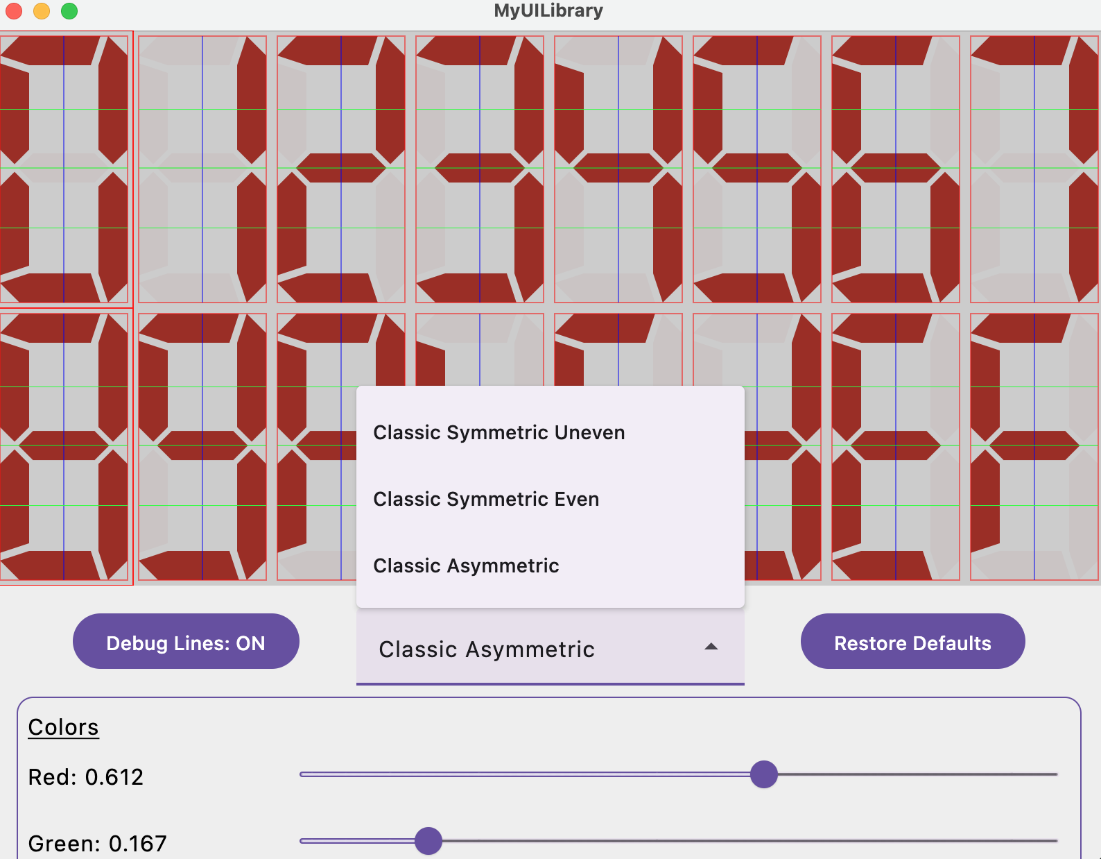
Conclusion
I will admit that I'm surprised at how much went in to improving the look and the configurability of the segmented display. However, now, we have a super-flexible display that enables allows for a lot of customization--to the extent that we can produce some of the segmented displays shared by Posy as well as design our own. In the next article, we'll improve the look of the segmented display a little more by implementing the ability to shear the segments by transforming the canvas on which they are drawn.
If you got this far. Thank you! And congratulations! I'd love it if you'd leave your feedback below. If you find any issues with any of the code, then let me know.