2024-07-18
Making a Rectangular Segmented Display

Series: Creating A Compose Multiplatform UI Library
- Create a Compose Multiplatform Library Project
- Making a Rectangular Segmented Display
- Improving the Look of the Segmented Display
- Shearing the Segmented Display
- Preparing for Release
- Releasing to Maven Central
Table of Contents
• Introduction
• TLDR
• Planning
• Canvas Basics
• Making an androidDebug Source Set
• Previewing a Canvas
• Drawing a Line
• Drawing Shapes
• Drawing a Closed Path
• BONUS: Drawing a Regular N-Gon
• Implementing a Single Character
• Defining the Character Drawing Function
• Adding Debug Guidelines
• Drawing the Horizontal Segments
• Drawing the Vertical Segments
• Activating and Deactivating Segments
• Refining and Parameterizing
• Adding Padding
• Parameterizing the Top Area Percentage
• Parameterizing the Thickness and Gap Size
• Drawing a Line of Text
• Transforming a String into Segment Activation Ints
• Rendering Multiple Characters on a Canvas
• Testing on Each Platform
• Conclusion
Introduction
This is article 2 in the series about creating a Compose Multiplatform UI library. The previous article guided the project setup, and this article builds on top of it by creating the first useful bit of UI: a rectangular segmented display. If you haven't followed the steps in the previous article, you should go back and do that now. The next article in this series will build upon this idea to make a nicer looking, classic 7-segment display.
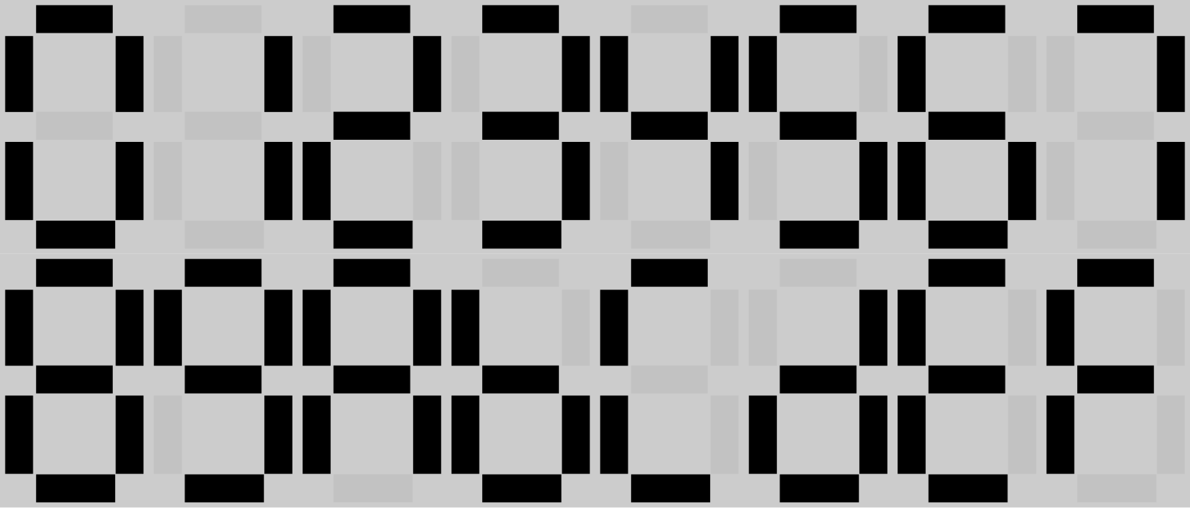
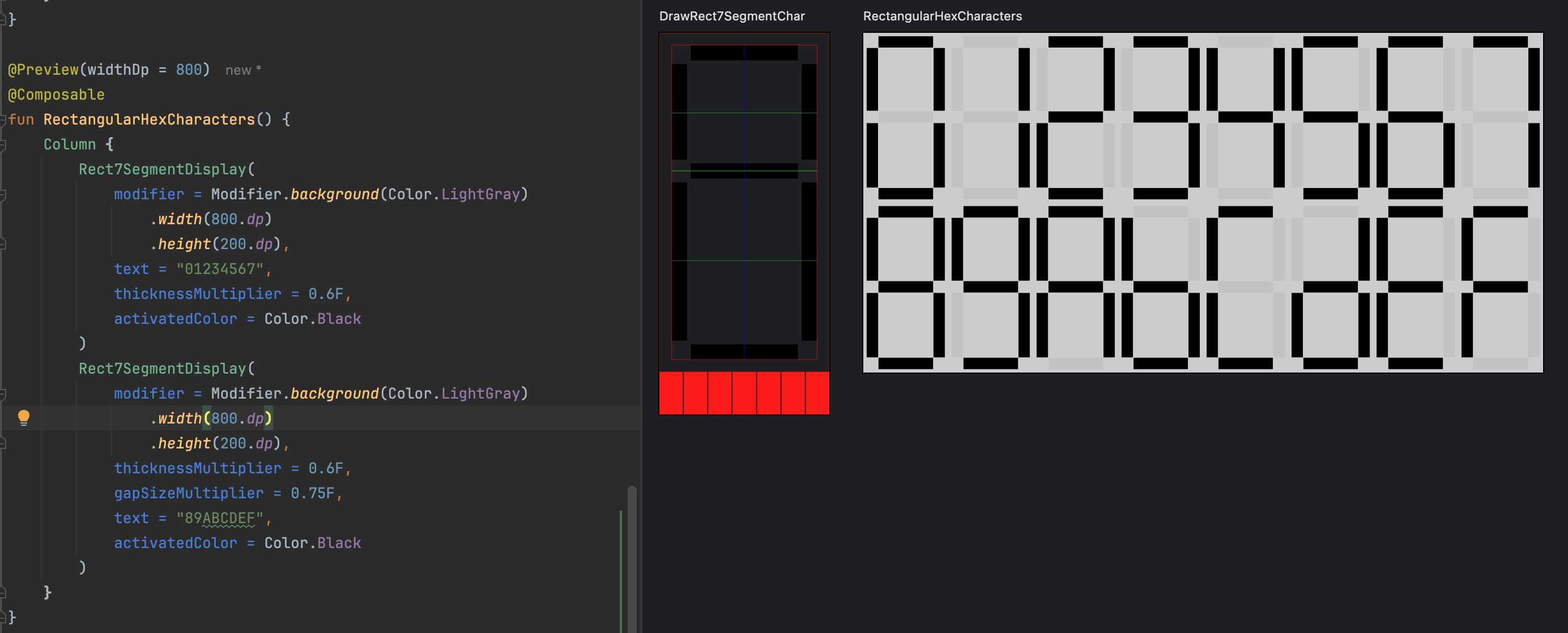
At the end of this article, you'll complete a rectangular 7-segment display that looks like this:
Just like the previous article, my assumption going in is that have no experience or little experience working with the Canvas. Therefore, the explanations in this article may be exactly right for some readers and too basic for others. Feel free to skip over some parts if you're a more advanced reader. Don't worry--they'll be there for you later if it turns out you need them.
TLDR
- Define the parameters of a 7-segment character drawing function that takes a
DrawScopereceiver. - Implement the above function
- Create a function to transform a character into your however you chose to represent whether any of the segments were activated
- Write a composable function that will render a line of text on a canvas, taking care to appropriately offset each character
- Wrap the composable function above with a new Composable function that uses the function from step 1 to render each character
- Use Compose Previews to monitor your progress along the way
- Write your own debug tooling to help you understand whether you've drawn correctly
Planning
Before getting started, it's a good idea to break down your approach into pieces that gradually step up the complication. Thus, we'll start with drawing a line on the canvas and work our way up to a functional 7-segment display.
Here's a rough outline of what we'll be doing:
- Canvas Basics
- Drawing a line
- Drawing shapes
- Drawing a closed path
- Bonus: Drawing a Regular N-Gon
- Implementing a single character
- Defining the basic character drawing function
- Setting up debug tooling
- Drawing the three horizontal segments
- Drawing the vertical segments
- Activating and deactivating segments
- Refining and parameterizing the character drawing function
- Drawing a line of text with our segmented display
- Transforming a string to segment activation integers
- Rendering multiple characters on a canvas
Canvas Basics
The Canvas is a powerful tool for drawing to the screen in Compose. It enables precise, detailed control for how to draw to the screen at the cost of forcing you to understand how and what to draw. This section will cover the basics of drawing to the Canvas.
If you already have a good grasp of Canvas basics, then you can skip to Implementing a Single Character.
Making an androidDebug Source Set
For this section, we'll be working in the androidDebug source set and leveraging Android Studio's preview tooling. We use the androidDebug source set because:
- we're not going to release from that source set, and therefore, we can write a bunch of code that we do not intend to release--providing a workspace for experimentation.
- Compose previews shorten the development loop, allowing you to preview your Composable functions without having to install on a device or run an application.
In your segmented-display/build.gradle.kts file, we have the following:
android {
    /* ... */
    dependencies {
        debugImplementation(compose.uiTooling)
    }
}
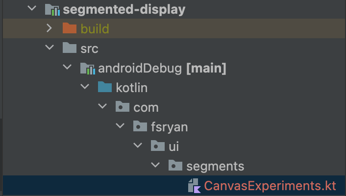
the debugImplementation(compose.uiTooling) line adds the Compose preview feature to the debug androidDebug source set. Android Studio will pick this up and enable the preview tooling (this also works in IntelliJ). All we have to do to start writing code is make the segmented-display/src/androidDebug/kotlin directory. I chose to match the package structure I've already cet up and make a Kotlin source file segmented-display/src/androidDebug/kotlin/com/fsryan/ui/segments/CanvasExperiments.kt.
Previewing a Canvas
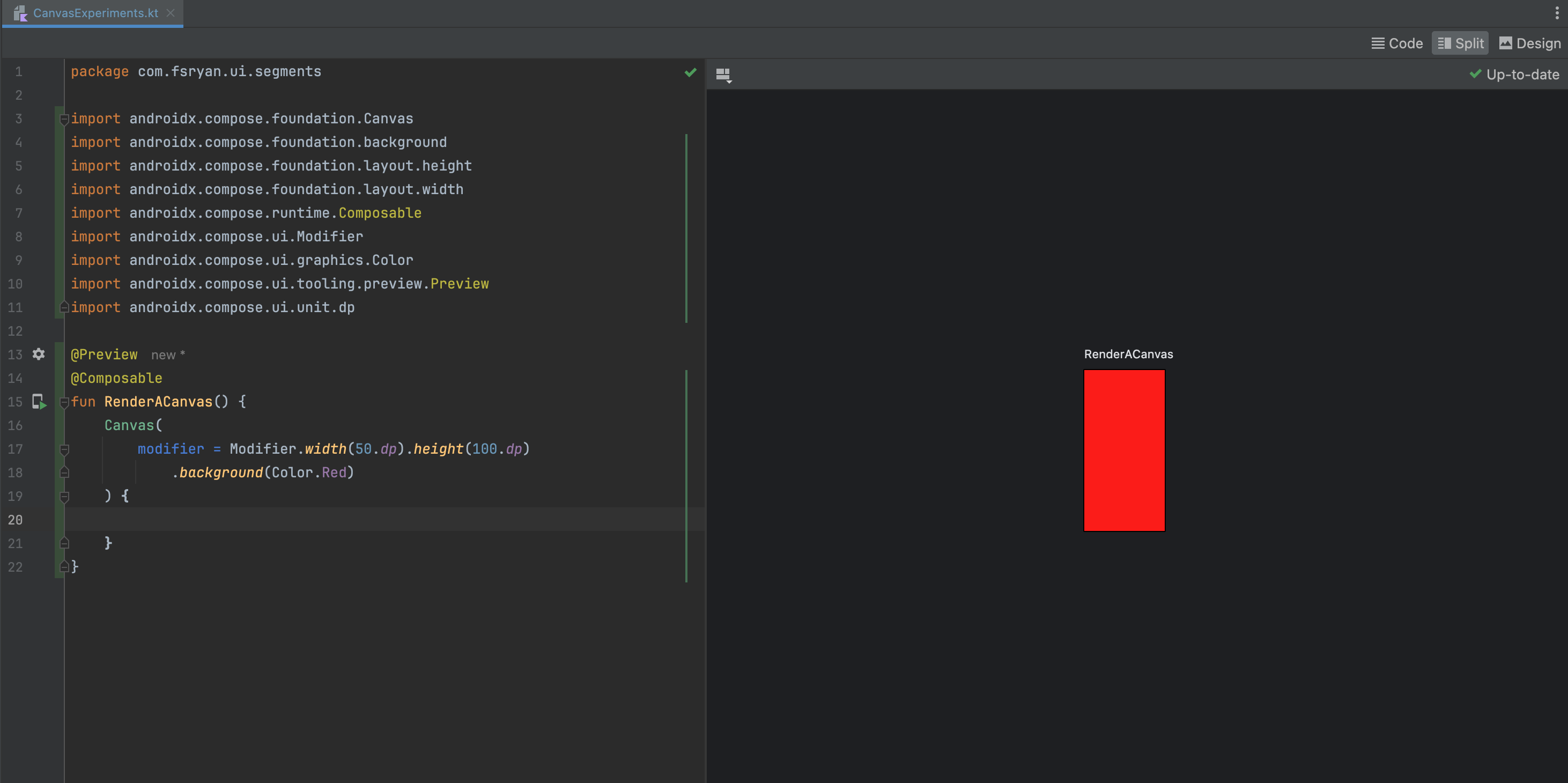
In our new CanvasExperiments.kt file, we'll start by creating a simple Composable function that renders an empty Canvas with a red background. This is just to test that we have our environment set up correctly for using the Preview feature.
package com.fsryan.ui.segments

import androidx.compose.foundation.Canvas
import androidx.compose.foundation.background
import androidx.compose.foundation.layout.height
import androidx.compose.foundation.layout.width
import androidx.compose.runtime.Composable
import androidx.compose.ui.Modifier
import androidx.compose.ui.graphics.Color
import androidx.compose.ui.tooling.preview.Preview
import androidx.compose.ui.unit.dp

@Preview
@Composable
fun RenderACanvas() {
    Canvas(
        modifier = Modifier.width(50.dp).height(100.dp)
            .background(Color.Red)
    ) {

    }
}
And what you should see is something like the following:
The import you need is import androidx.compose.foundation.Canvas. There are other Canvas identifiers that you will have access to, but that specific Composable function is what you need.
If you don't have a working preview, then it's best to stop here and fix the issue. The Compose preview tool requires a working build. The IDE usually gives you an indication if you need to rebuild the project in order to show the preview or whether your preview is out of date--so just follow what it says. While there are some other issues that could cause the previews to not render, the most common issues are non-compiling code and missing dependencies.
Drawing a Line
The above Canvas was entirely empty. The red color was actually a consequence of applying the background modifier. In the same CanvasExperiments.kt file, Let's draw a solid blue vertical line right down the middle and a solid green horizontal line right across the middle of the Canvas.
First, the vertical line:
@Preview
@Composable
fun RenderAVerticalLine() {
    Canvas(
        modifier = Modifier.width(50.dp).height(100.dp)
    ) {
        drawLine(
            color = Color.Blue,
            start = Offset(x = size.width / 2, y = 0F),
            end = Offset(x = size.width / 2, y = size.height)
        )
    }
}
Here, we're passing a function as the final argument of the Canvas composable function. This function is a function that has a DrawScope receiver. The DrawScope provides basic drawing functions like drawLine, etc.
The DrawScope.() -> Unit function IS NOT A COMPOSABLE FUNCTION. If you need to take anything out of the composition context (usually, something from your theme), you cannot do that in this function.
That said, however, the DrawScope object we're using inside this function has many useful functions and properties.
Before we move on, the following points are very important for you to orient yourself:
- In contrast to what you're used to from math class, the origin (0, 0) describes the top-left corner of the
Canvas. The x-axis increases to the right, and the y-axis increases DOWNWARD. - We also work with
Floatvalues. These float values are in PIXELS--not DPs. - The
DrawScopehas adensityproperty which describes the pixel density of the screen. You can use the density to convert between dp and pixels. - An
Offsetis an offset FROM THE ORIGIN of theCanvasin pixels.
Armed with this knowledge, lets draw the horizontal line:
@Preview
@Composable
fun RenderAHorizontalLine() {
    Canvas(
        modifier = Modifier.width(50.dp).height(100.dp)
    ) {
        drawLine(
            color = Color.Green,
            start = Offset(x = 0F, y = size.height / 2),
            end = Offset(x = size.width, y = size.height / 2)
        )
    }
}
When you're done, your preview should look like this:
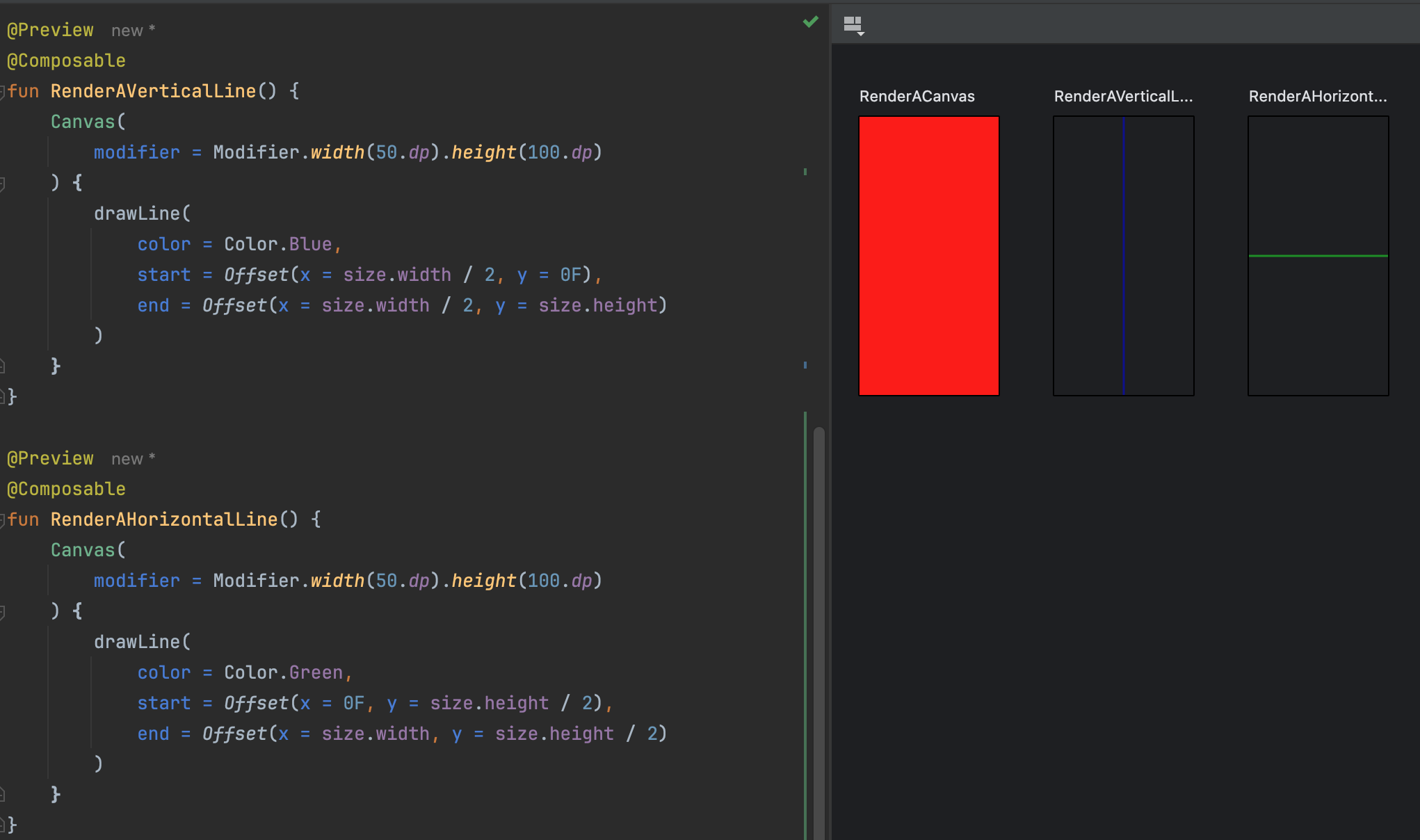
You can get pretty fancy drawing lines, supplying the stroke cap (how you want the ends of the line to look), the path effect (how you want the line to be drawn). This article would be too large to cover all the options, so I'll leave that to you to explore.
Drawing Shapes
DrawScope has a variety of shape-drawing functions that can ease the burden of drawing some simple shapes. In this section, we'll demo a few of them.
First, let's draw a rectangle:
@Preview
@Composable
fun RenderARectangle() {
    Canvas(
        modifier = Modifier.width(50.dp).height(100.dp)
    ) {
        drawRect(
            color = Color.Magenta,
            topLeft = Offset(x = 10F, y = 10F),
            size = size.copy(width = size.width - 20, height = size.height - 20)
        )
    }
}
The best part about drawing the rect over drawing lines to create a closed path that describes a rectangle is that you get to describe the rectangle that should be drawn in terms of the parameters of a rectangle instead of focusing line-by-line.
Next, let's draw a circle:
@Preview
@Composable
fun RenderACircle() {
    Canvas(
        modifier = Modifier.width(50.dp).height(100.dp)
    ) {
        drawCircle(
            color = Color.Yellow,
            center = Offset(x = size.width / 2, y = size.height / 2),
            radius = size.width / 3
        )
    }
}
Again, with circles, the DrawScope provides a function that allows you to describe the circle in terms of the parameters of a circle, namely, the center of the circle and its radius.
When you're done, your preview should look like this: 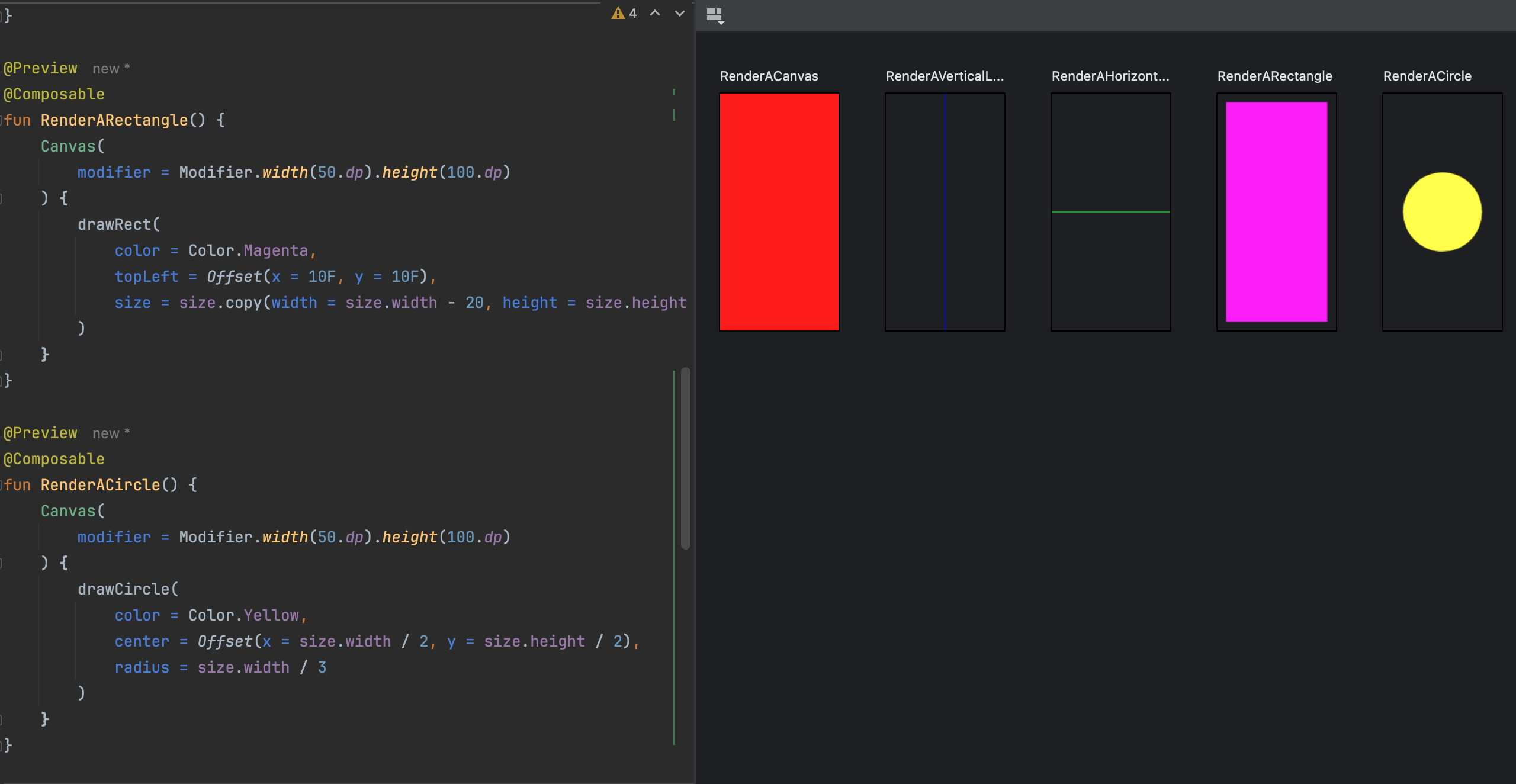
Drawing a Closed Path
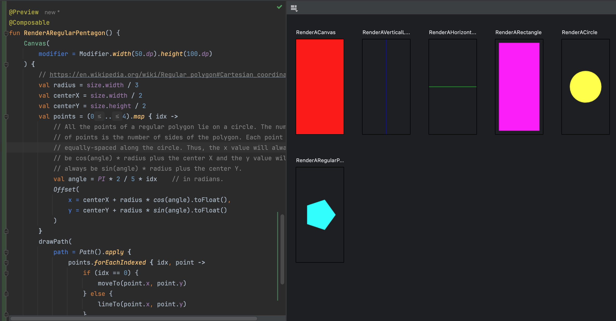
Drawing rectangles, ovals, and circles is great, but, sometimes we will need to draw a closed path that is some custom shape. The DrawScope provides a function for that as well. In this section, we'll draw a regular pentagon.
Sometimes drawing on a Canvas involves use of math. It's okay if you don't understand the math fully. It's the end result that matters. And you can check the end result by looking at the Compose Preview.
@Preview
@Composable
fun RenderARegularPentagon() {
   Canvas(
      modifier = Modifier.width(50.dp).height(100.dp)
   ) {
      // https://en.wikipedia.org/wiki/Regular_polygon#Cartesian_coordinates
      val radius = size.width / 3
      val centerX = size.width / 2
      val centerY = size.height / 2
      val points = (0..4).map { idx ->
         // All the points of a regular polygon lie on a circle. The number
         // of points is the number of sides of the polygon. Each point is
         // equally-spaced along the circle. Thus, the x value will always
         // be cos(angle) * radius plus the center X and the y value will
         // always be sin(angle) * radius plus the center Y.
         val angle = PI * 2 / 5 * idx    // in radians.
         Offset(
            x = centerX + radius * cos(angle).toFloat(),
            y = centerY + radius * sin(angle).toFloat()
         )
      }
      drawPath(
         path = Path().apply {
            points.forEachIndexed { idx, point ->
               if (idx == 0) {
                  moveTo(point.x, point.y)
               } else {
                  lineTo(point.x, point.y)
               }
            }
            close()
         },
         color = Color.Cyan
      )
   }
}
Here, we define a custom path that describes a regular pentagon. The drawPath function enables creation of an arbitrary path (there are many ways to draw between points). The drawPath function takes a Path object that describes the path to draw. The Path object is a series of commands that describe how to draw the path. In this case, we use the moveTo function to move the "pen" to the first point, and then we use the lineTo function to draw lines to the subsequent points. Finally, we use the close function to close the path, drawing a stright line from the current offset to the beginning of the path.
The initial moveTo call sets the starting point of the path. As you call lineTo, the current location is updated, and the next lineTo or other path-drawing function will draw from the current location to the new location, updating the current location.
When you're done, your preview should look like this:
Bonus: Drawing a Regular N-Gon
If you're not interested, feel free to skip this part. This section is not necessary to complete this article, but should help you understand why you may want to draw custom paths. Additionally, it demonstrates use of the interactive mode. Furthermore, if you're wondering how to draw text, this is a basic example.
Since the code we wrote above can be easily generalized to draw any regular n-gon, you can imagine parameterizing it:
@Preview
@Composable
fun RenderARegularNGon() {
   var sideCount by remember { mutableIntStateOf(5) }  // side count is the parameter
   val textMeasurer = rememberTextMeasurer()

   // The column wraps the canvas and the buttons
   Column(
      modifier = Modifier
         .width(50.dp)
         .height(100.dp)
   ) {
      Canvas(
         modifier = Modifier
            .width(50.dp)
            .height(75.dp)
      ) {
         // This is the same drawing code as before, just with a larger radius
         val radius = size.width / 2.3F
         val centerX = size.width / 2
         val centerY = size.height / 2
         val points = (0..sideCount).map { idx ->
            val angle = PI * 2 / sideCount * idx    // in radians.
            Offset(
               x = centerX + radius * cos(angle).toFloat(),
               y = centerY + radius * sin(angle).toFloat()
            )
         }
         drawPath(
            path = Path().apply {
               points.forEachIndexed { idx, point ->
                  if (idx == 0) {
                     moveTo(point.x, point.y)
                  } else {
                     lineTo(point.x, point.y)
                  }
               }
               close()
            },
            color = Color.Cyan
         )

         // Here, were drawing text that has the current side count
         val measuredSize = textMeasurer.measure("$sideCount")
         drawText(
            textLayoutResult = measuredSize,
            brush = SolidColor(Color.Black),
            topLeft = Offset(
               x = centerX - measuredSize.size.width.toFloat() / 2,
               y = centerY - measuredSize.size.height.toFloat() / 2
            )
         )
      }
      // Below is our basic control surface for incrementing/decrementing the
      // count
      Row(
         modifier = Modifier
            .fillMaxWidth()
            .height(25.dp)
      ) {
         Box(
            modifier = Modifier
               .weight(1F)
               .fillMaxHeight()
               .background(Color.Red)
               .clickable { // red button reduces the number of sides
                  if (sideCount > 3) {
                     sideCount--
                  }
               }
         ) {
         }
         Box(
            modifier = Modifier
               .weight(1F)
               .fillMaxHeight()
               .background(Color.Green)
               .clickable { sideCount++ }  // green button increases the number of sides
         ) {
         }
      }
   }
}
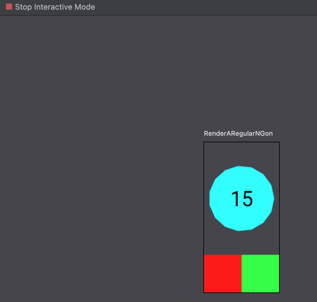
When your preview renders, you can initiate interactive mode:
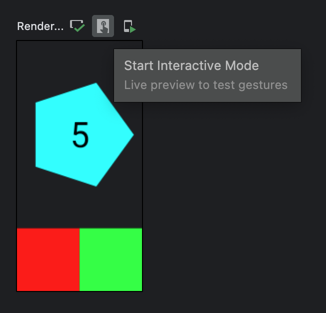
This will enable you to click on the red and green buttons, which respectively decrement and increment the side count. Interactive mode looks like this:
Implementing a Single Character
Now that we've gained some comfort drawing lines, shapes, etc. We'll move on to implementing a single 7-segment character with rectangular shapes. In this section, we'll define a function that takes a DrawScope receiver and draws a single character to the canvas. We'll also set up some debug tooling to help us visually confirm that we drew the character correctly.
Instead of implementing our function in the androidDebug source set, lets create two new files:
- To contain code we intend to draw the rectangular-7-segment character in the commonMain source set:
segmented-display/src/commonMain/kotlin/com/fsryan/ui/segments/Rect7SegmentDisplay.kt - To preview the code in the androidDebug source set:
segmented-display/src/androidDebug/kotlin/com/fsryan/ui/segments/Rect7SegmentDisplayPreview.kt
Defining the Character Drawing Function
A basic 7-segment character has:
- a description of the activated segments (we will use an
Int--more on this later) - 3 horizontal segments (top, middle, and bottom)
- 4 vertical segments (top-left, top-right, bottom-left, and bottom-right)
- a top section that is slightly shorter than the bottom section
- gaps between the segments
- an activated color
- a deactivated color (because a deactivated segment still exists--it's just usually dimmer than the activated segment)
However, we're ultimately planning on drawing multiple characters per canvas, therefore, we'll need to know:
- the origin offset for this character
- the width
- the height
- the padding (were we to draw the maximum size, then consecutive characters would have touching segments)
Thus, our target should be to ultimately have a function like this:
fun DrawScope.drawRect7SegmentChar(
    activatedSegments: Int,
    origin: Offset,
    width: Float,
    height: Float,
    topLeftPadding: Offset,
    bottomRightPadding: Offset,
    topAreaPercentage: Float,
    thicknessMultiplier: Float,
    gapSizeMultiplier: Float,
    activatedColor: Color,
    deactivatedColor: Color
) {
    /* ... */
}
However, that's a little too much to worry about all at once. Let's simplify for now by:
- Activating all segments
- Setting the origin to
Offset(0F, 0F) - Not allowing any padding
- Making the top area the same size as the bottom area
- Hardcoding the thickness
- Hardcoding the gap size
- Hardcoding the activated and deactivated colors
That simplifies our function to:
package com.fsryan.ui.segments

import androidx.compose.ui.graphics.drawscope.DrawScope

fun DrawScope.drawRect7SegmentChar(
   width: Float,
   height: Float
) {
}
And let's make a preview function (in the androidDebug source set):
package com.fsryan.ui.segments

import androidx.compose.foundation.Canvas
import androidx.compose.foundation.layout.height
import androidx.compose.foundation.layout.width
import androidx.compose.runtime.Composable
import androidx.compose.ui.Modifier
import androidx.compose.ui.tooling.preview.Preview
import androidx.compose.ui.unit.dp

@Preview
@Composable
fun DrawRect7SegmentChar() {
    Canvas(
        modifier = Modifier.width(200.dp)
            .height(400.dp)
    ) {
        drawRect7SegmentChar(
            width = size.width,
            height = size.height
        )
    }
}
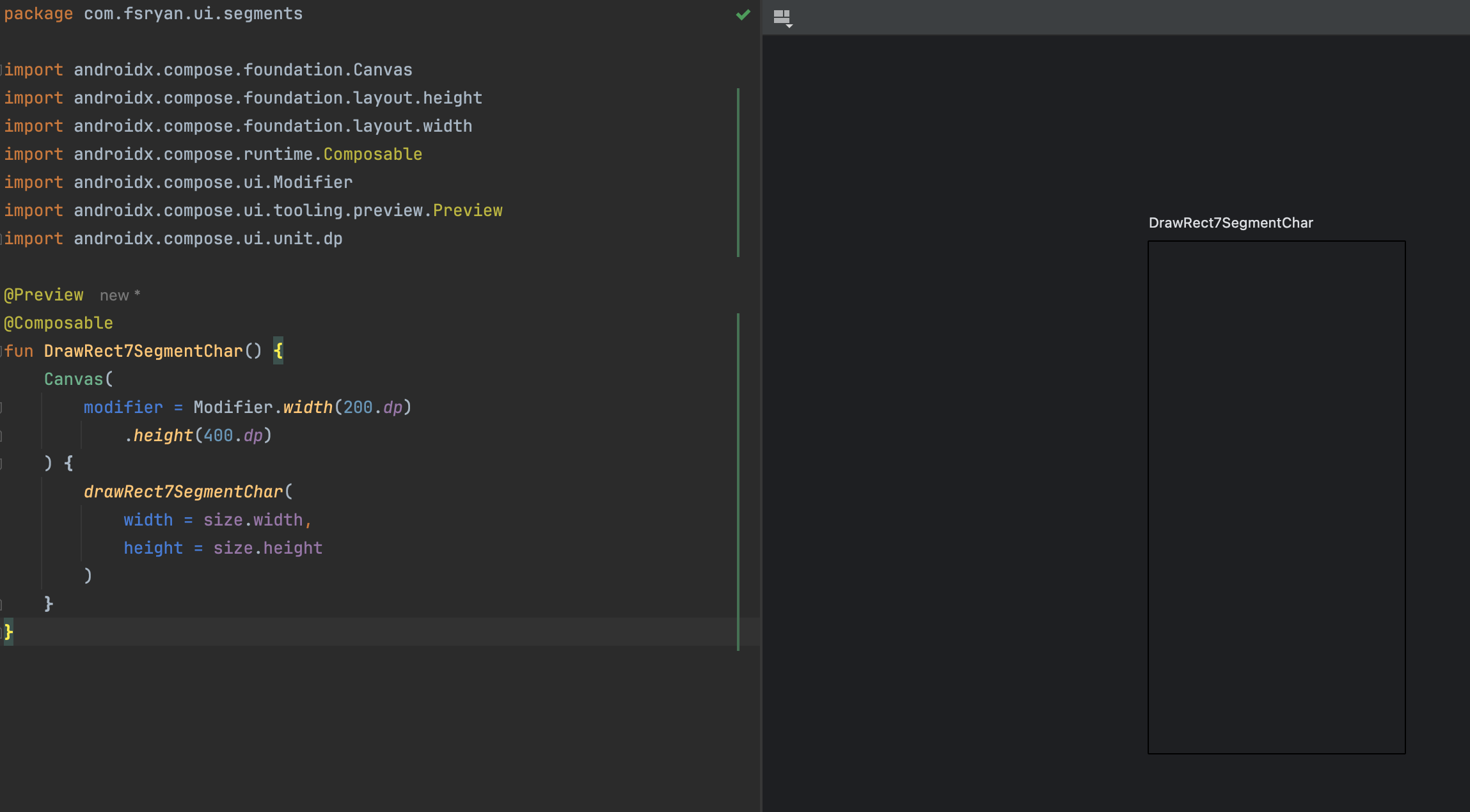
When you're done, your preview window should look like this:
Adding Debug Guidelines
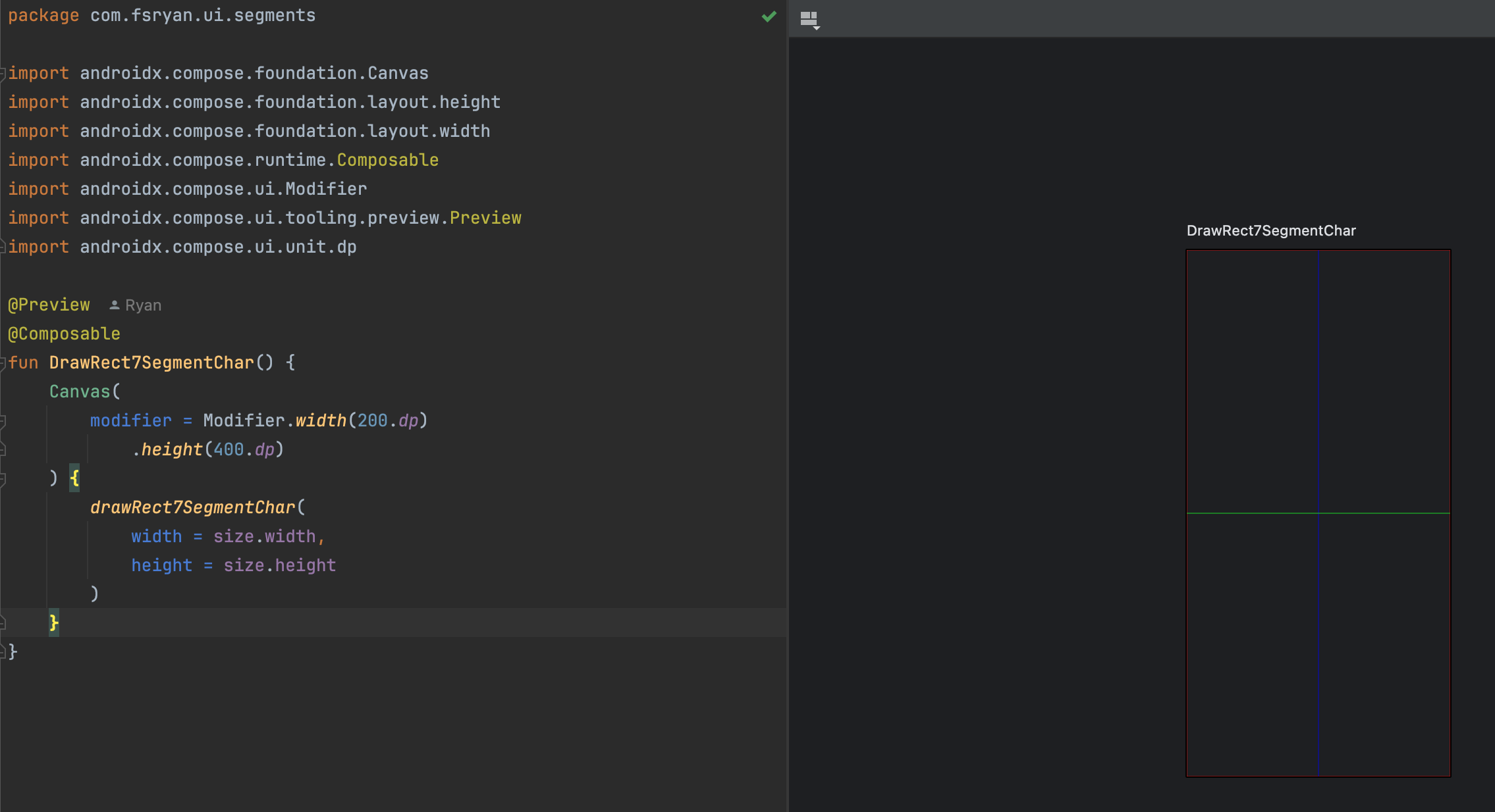
It's easy to become lost when drawing to a canvas. Therefore, it's a good idea to add some debug guidelines to help you understand where you are drawing. In this section, we'll add some debug guidelines to our drawRect7SegmentChar function. Visually, this should help us check whether we're on-off track.
But first, we need to understand a few things about the area in which we can draw:
- What is the origin? We're going to hardcode this to (0, 0) for now.
- What is are the width and height that we can draw in? For now, we'll set that to the
widthandheightparameters passed to the function. However, when we enable padding, we'll need to adjust these values.
So we can adjust our DrawScope.drawRect7SegmentChar function like this:
package com.fsryan.ui.segments

import androidx.compose.ui.geometry.Offset
import androidx.compose.ui.geometry.Size
import androidx.compose.ui.graphics.Color
import androidx.compose.ui.graphics.SolidColor
import androidx.compose.ui.graphics.drawscope.DrawScope
import androidx.compose.ui.graphics.drawscope.Stroke

fun DrawScope.drawRect7SegmentChar(
    width: Float,
    height: Float,
    debuggingEnabled: Boolean = true
) {

    val origin = Offset(x = 0F, y = 0F)

    // Here we define some important values that serve as anchor points and
    // sizes that can be referenced to draw correctly
    val leftmostX = origin.x
    val topY = origin.y
    val drawableWidth = width
    val drawableHeight = height
    val centerX = leftmostX + drawableWidth / 2
    val centerY = topY + drawableHeight / 2

    // debugging
    if (debuggingEnabled) {
        // Drawable Area
        drawRect(
            brush = SolidColor(Color.Red),
            topLeft = Offset(x = leftmostX, y = topY),
            size = Size(width = drawableWidth, height = drawableHeight),
            style = Stroke(width = Stroke.HairlineWidth)
        )
        // Vertical center line
        drawLine(
            brush = SolidColor(Color.Blue),
            start = Offset(x = centerX, y = topY),
            end = Offset(x = centerX, y = topY + drawableHeight)
        )
        // Horizontal Center line of the top segment
        drawLine(
            brush = SolidColor(Color.Green),
            start = Offset(x = leftmostX, y = centerY),
            end = Offset(x = leftmostX + drawableWidth, y = centerY),
        )
    }
}
If your preview says that it's out of date, just rebuild to rerender the preview. This is what you should see:
Drawing the Horizontal Segments
Before we can draw any segment, we have to figure out what the segment thickness and gap size should be
For now, we'll hardcode the thickness and gap size:
val configuredThickness = 29F / 240.37F * drawableHeight
val gapSize = configuredThickness / 10
val halfGapSize = gapSize / 2
val actualThickness = configuredThickness - halfGapSize
The values I picked are arbitrary, but they don't look bad. Let the end look and your creativity be your guide.
I'm using a technique here, where the thickness is a percentage of the drawable height. This enables the thickness to scale with the drawable height. You don't have to do it like this, but I've found it ends up looking better this way.
Knowing the above values enables us to calculate the sizes of each horizontal segment:
val horizontalSegmentLength = drawableWidth - gapSize - 2 * actualThickness
val horizonalSegmentStartX = leftmostX + actualThickness + halfGapSize
This accounts for the gap size (by dividing it equally on either side) and for the horizontal space of the vertical segments. It also sets the initial X value for the horizontal segments
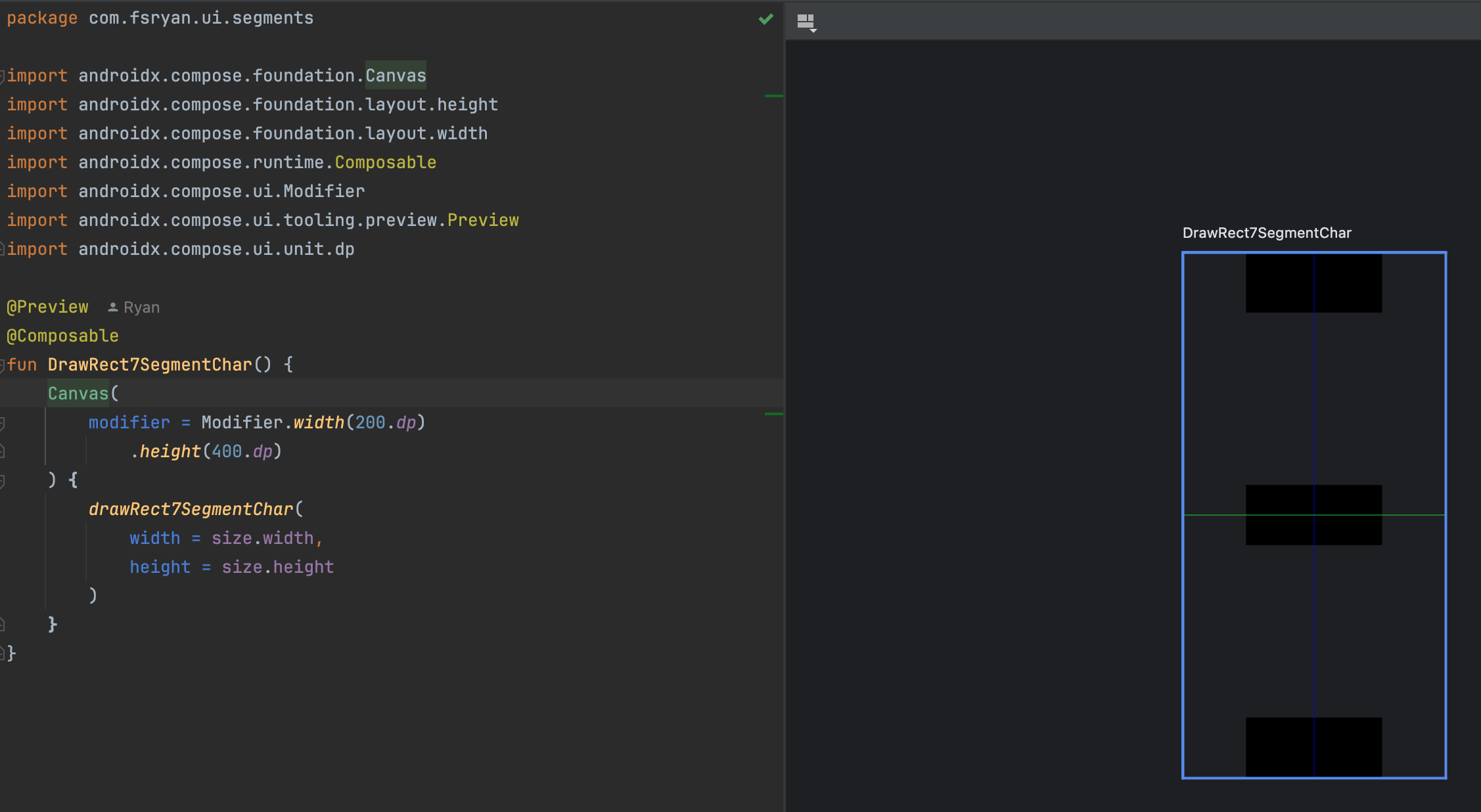
Now we can draw the horizontal segments:
// top horizontal segment
drawRect(
   brush = SolidColor(Color.Black),
   topLeft = Offset(x = horizonalSegmentStartX, y = topY),
   size = Size(width = horizontalSegmentLength, height = actualThickness)
)
// middle horizontal segment
drawRect(
   brush = SolidColor(Color.Black),
   topLeft = Offset(x = horizonalSegmentStartX, y = centerY - actualThickness / 2),
   size = Size(width = horizontalSegmentLength, height = actualThickness)
)
// bottom horizontal segment
drawRect(
   brush = SolidColor(Color.Black),
   topLeft = Offset(x = horizonalSegmentStartX, y = topY + drawableHeight - actualThickness),
   size = Size(width = horizontalSegmentLength, height = actualThickness)
)
Now if you refresh the preview, you should see the following:
Drawing the Vertical Segments
Drawing the vertical segments follows a similar pattern, but is a little more difficult. We just need to calculate the start and end y positions to calculate the height of the rectangle as well as calculate the starting X of the vertical segments on the right.
val topVerticalSegmentStartY = topY + actualThickness + halfGapSize
val topVerticalSegmentEndY = centerY - actualThickness / 2 - halfGapSize
val topVerticalSegmentHeight = topVerticalSegmentEndY - topVerticalSegmentStartY
val bottomVerticalSegmentStartY = centerY + actualThickness / 2 + halfGapSize
val bottomVerticalSegmentEndY = topY + drawableHeight - actualThickness - halfGapSize
val bottomVerticalSegmentHeight = bottomVerticalSegmentEndY - bottomVerticalSegmentStartY
val rightVerticalSegmentStartX = leftmostX + drawableWidth - actualThickness
Armed with the above values, we can draw the vertical segments:
// top-left vertical segment
drawRect(
  brush = SolidColor(Color.Black),
  topLeft = Offset(x = leftmostX, y = topVerticalSegmentStartY),
  size = Size(width = actualThickness, height = topVerticalSegmentHeight)
)
// top-right vertical segment
drawRect(
  brush = SolidColor(Color.Black),
  topLeft = Offset(x = rightVerticalSegmentStartX, y = topVerticalSegmentStartY),
  size = Size(width = actualThickness, height = topVerticalSegmentHeight)
)
// bottom-left vertical segment
drawRect(
  brush = SolidColor(Color.Black),
  topLeft = Offset(x = leftmostX, y = bottomVerticalSegmentStartY),
  size = Size(width = actualThickness, height = bottomVerticalSegmentHeight)
)
// bottom-right vertical segment
drawRect(
  brush = SolidColor(Color.Black),
  topLeft = Offset(x = rightVerticalSegmentStartX, y = bottomVerticalSegmentStartY),
  size = Size(width = actualThickness, height = bottomVerticalSegmentHeight)
)
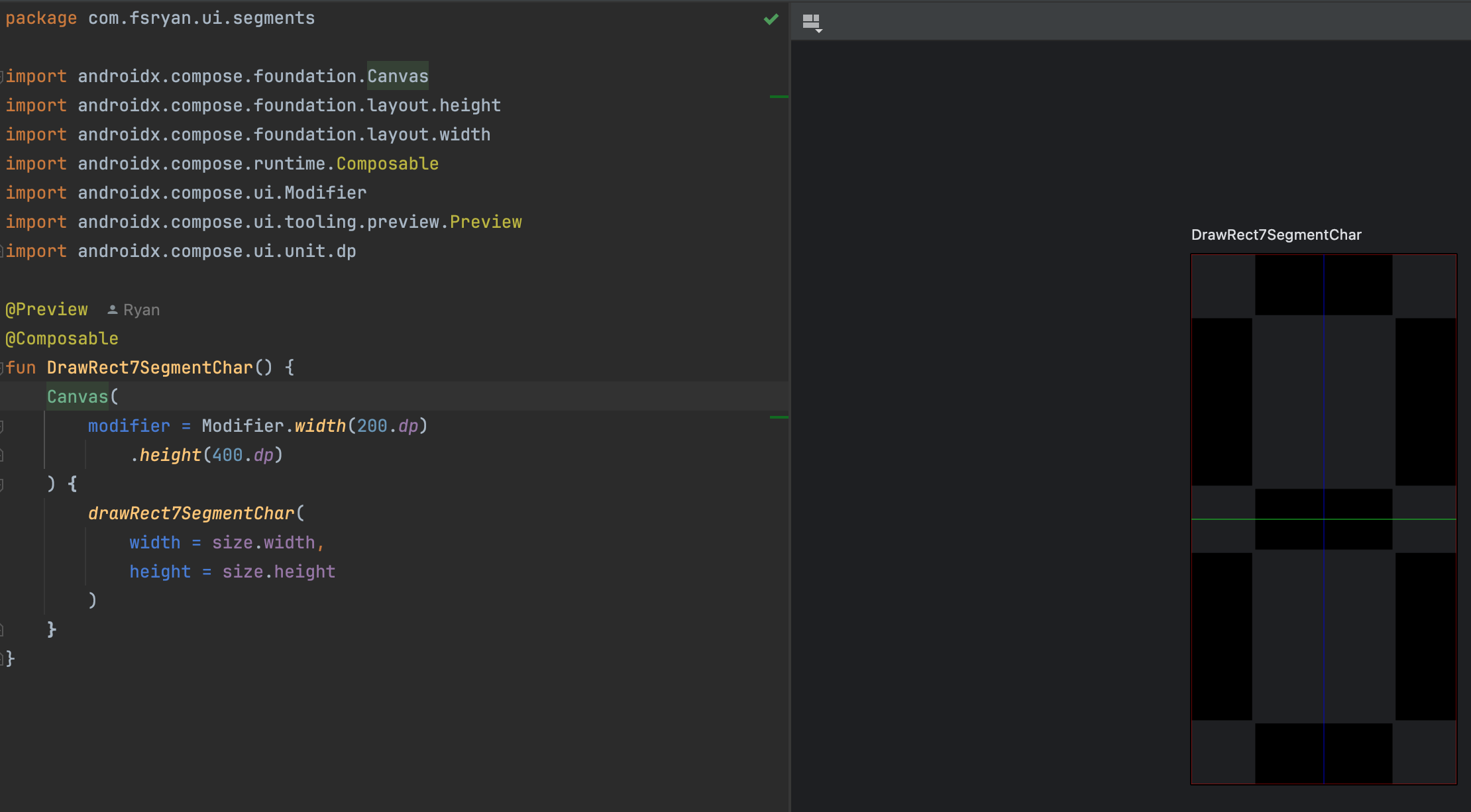
When you've refreshed your preview, it should look like this:
Activating and Deactivating Segments
We've made lots of great progress so far, but we now have to determine how we activate and deactivate segments. This requires:
- A means of describing the segments that should be activated and deactivated
- An activated color
- A deactivated color
We'll add those parameters to our drawRect7SegmentChar function:
fun DrawScope.drawRect7SegmentChar(
   activatedSegments: Int,
   width: Float,
   height: Float,
   activatedColor: Color,
   deactivatedColor: Color = activatedColor.copy(alpha = 0.05F),
   debuggingEnabled: Boolean = true
) {
    /* .. */
}
We've described the activated segments with an Int, but we're only going to look at the least significant 7 bits of the Int value. If you're unfamiliar, an Int in Kotlin is a 32-bit signed integer. The least significant 7 bits are the bits that are the rightmost 7 bits. We'll use the rightmost 7 bits to describe the activated segments. The below attempts to map the segments to the position of the bit that we will look at in the integer:
 1111
2    3
2    3
2    3
 4444
5    6
5    6
5    6
 7777
In other words, if we want to know if the bottom-left segment is activated, we check:
activatedSegments and 0b10000 != 0
because the bottom-left segment is the 5th segment from the right in the activatedSegments integer.
Now that we have a means of detecting whether we should activate or deactivate a segment, we can modify our drawRect7SegmentChar function:
val activatedBrush = SolidColor(activatedColor)
val deactivatedBrush = SolidColor(deactivatedColor)
// top horizontal segment
drawRect(
  brush = if (activatedSegments and 0b1 != 0) activatedBrush else deactivatedBrush,
  topLeft = Offset(x = horizonalSegmentStartX, y = topY),
  size = Size(width = horizontalSegmentLength, height = actualThickness)
)
// middle horizontal segment
drawRect(
  brush = if (activatedSegments and 0b1000 != 0) activatedBrush else deactivatedBrush,
  topLeft = Offset(x = horizonalSegmentStartX, y = centerY - actualThickness / 2),
  size = Size(width = horizontalSegmentLength, height = actualThickness)
)
// bottom horizontal segment
drawRect(
  brush = if (activatedSegments and 0b1000000 != 0) activatedBrush else deactivatedBrush,
  topLeft = Offset(x = horizonalSegmentStartX, y = topY + drawableHeight - actualThickness),
  size = Size(width = horizontalSegmentLength, height = actualThickness)
)
// top-left vertical segment
drawRect(
  brush = SolidColor(if (activatedSegments and 0b10 != 0) activatedColor else deactivatedColor),
  topLeft = Offset(x = leftmostX, y = topVerticalSegmentStartY),
  size = Size(width = actualThickness, height = topVerticalSegmentHeight)
)
// top-right vertical segment
drawRect(
  brush = SolidColor(if (activatedSegments and 0b100 != 0) activatedColor else deactivatedColor),
  topLeft = Offset(x = rightVerticalSegmentStartX, y = topVerticalSegmentStartY),
  size = Size(width = actualThickness, height = topVerticalSegmentHeight)
)
// bottom-left vertical segment
drawRect(
  brush = SolidColor(if (activatedSegments and 0b10000 != 0) activatedColor else deactivatedColor),
  topLeft = Offset(x = leftmostX, y = bottomVerticalSegmentStartY),
  size = Size(width = actualThickness, height = bottomVerticalSegmentHeight)
)
// bottom-right vertical segment
drawRect(
  brush = SolidColor(if (activatedSegments and 0b100000 != 0) activatedColor else deactivatedColor),
  topLeft = Offset(x = rightVerticalSegmentStartX, y = bottomVerticalSegmentStartY),
  size = Size(width = actualThickness, height = bottomVerticalSegmentHeight)
)
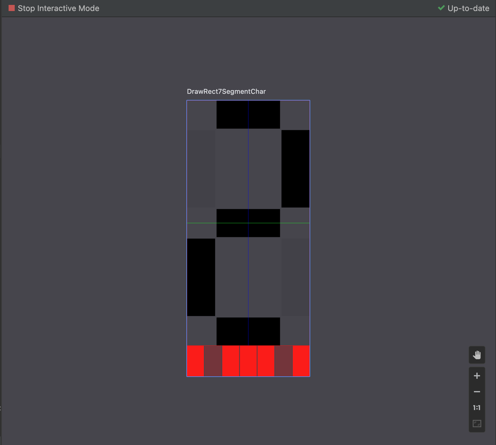
Here's where we MUST stop and test. Wouldn't it be nice if we could interact with our preview to check whether our segment activation code was working properly? Good news! We can do that. Let's update our preview function:
package com.fsryan.ui.segments

import androidx.compose.foundation.Canvas
import androidx.compose.foundation.background
import androidx.compose.foundation.clickable
import androidx.compose.foundation.layout.Arrangement
import androidx.compose.foundation.layout.Box
import androidx.compose.foundation.layout.Column
import androidx.compose.foundation.layout.Row
import androidx.compose.foundation.layout.height
import androidx.compose.foundation.layout.width
import androidx.compose.runtime.Composable
import androidx.compose.runtime.getValue
import androidx.compose.runtime.mutableIntStateOf
import androidx.compose.runtime.remember
import androidx.compose.runtime.setValue
import androidx.compose.ui.Modifier
import androidx.compose.ui.draw.rotate
import androidx.compose.ui.graphics.Color
import androidx.compose.ui.tooling.preview.Preview
import androidx.compose.ui.unit.dp

@Preview
@Composable
fun DrawRect7SegmentChar() {
   Column {
      var activatedSegments by remember { mutableIntStateOf(0b01111111) }
      Canvas(
         modifier = Modifier.width(200.dp)
            .height(400.dp)
      ) {
         drawRect7SegmentChar(
            activatedSegments = activatedSegments,
            width = size.width,
            height = size.height,
            activatedColor = Color.Black
         )
      }
      Row(
         modifier = Modifier
            .width(200.dp)
            // rotating 180 degrees enables us to see the least significant bit on the RIGHT
            .rotate(180F),
         horizontalArrangement = Arrangement.spacedBy(1.dp)
      ) {
         for (i in 0 until 7) {
            val activated = (activatedSegments and (1 shl i)) != 0
            Box(
               modifier = Modifier.height(50.dp)
                  .weight(1F)
                  .background(if (activated) Color.Red else Color.Red.copy(alpha = 0.25F))
                  .clickable { activatedSegments = activatedSegments xor (1 shl i) }
            )
         }
      }
   }
}
If you are not familiar with bitwise operations, I recommend you read up on them (I may write a small blog post series on them in the future). The above code makes the activated segments a mutable state. Then we use the bitwise xor operator to flip bits of the activatedSegments integer on and off.
Now, if we enter interactive mode on this compose preview, we should be able to test out each segment individually. When you're done, your preview should look like this:
Refining and Parameterizing
We're almost done drawing a single character with our rectangular 7-segment display. Now we just need to parameterize our function such that:
- We can pad the character so that it doesn't take the full width/height
- We can change the top area percentage
- We can change the thickness multiplier
- We can change the gap size multiplier
Adding Padding
We'll start with the padding, using an Offset to describe the left and top padding and an Offset to describe the right and bottom padding in pixels:
fun DrawScope.drawRect7SegmentChar(
    activatedSegments: Int,
    width: Float,
    height: Float,
    topLeftPadding: Offset,
    bottomRightPadding: Offset,
    activatedColor: Color,
    deactivatedColor: Color = activatedColor.copy(alpha = 0.05F),
    debuggingEnabled: Boolean = true
) {
    /* ... */
}
Now you can probably see why we calculated the leftmostX, topY, drawableWidthanddrawableHeight` values. We can now adjust those values to account for the padding:
val leftmostX = origin.x + topLeftPadding.x
val topY = origin.y + topLeftPadding.y
val drawableWidth = width - topLeftPadding.x - bottomRightPadding.x
val drawableHeight = height - topLeftPadding.y - bottomRightPadding.y
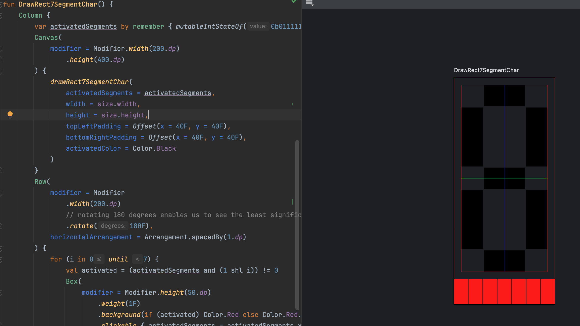
Now that we have a difference between the area and the drawable area, it would be a good idea to add a debug guideline for the padding. To do this, we can draw a rectangle:
 // debugging
 if (debuggingEnabled) {
     // Allocated Area
     drawRect(
         brush = SolidColor(Color.Red),
         topLeft = Offset(x = 0F, y = 0F),
         size = Size(width = width, height = height),
         style = Stroke(width = Stroke.HairlineWidth)
     )
     // Drawable Area
     drawRect(
         brush = SolidColor(Color.Red),
         topLeft = Offset(x = leftmostX, y = topY),
         size = Size(width = drawableWidth, height = drawableHeight),
         style = Stroke(width = Stroke.HairlineWidth)
     )
     // Vertical center line
     drawLine(
         brush = SolidColor(Color.Blue),
         start = Offset(x = centerX, y = topY),
         end = Offset(x = centerX, y = topY + drawableHeight)
     )
     // Horizontal Center line of the top segment
     drawLine(
         brush = SolidColor(Color.Green),
         start = Offset(x = leftmostX, y = centerY),
         end = Offset(x = leftmostX + drawableWidth, y = centerY),
     )
 }
Finally, we update our call to the drawRect7SegmentChar function in the preview:
drawRect7SegmentChar(
    activatedSegments = activatedSegments,
    width = size.width,
    height = size.height,
    topLeftPadding = Offset(x = 40F, y = 40F),
    bottomRightPadding = Offset(x = 40F, y = 40F),
    activatedColor = Color.Black
)
When you're done, your preview should look like this:
Parameterizing the Top Area Percentage
Presently, we've divided the top and the bottom area of the character equally. However, according to Posy's video, normally the top area is slightly shorter than the bottom. Looking at his segments sheet, it appears that the top area takes up about 49.5% of the total height. We can parameterize this value:
fun DrawScope.drawRect7SegmentChar(
    activatedSegments: Int,
    width: Float,
    height: Float,
    topLeftPadding: Offset,
    bottomRightPadding: Offset,
    topAreaPercentage: Float,
    gapSizeMultiplier: Float,
    activatedColor: Color,
    deactivatedColor: Color = activatedColor.copy(alpha = 0.05F)
) {
    /* ... */
}
However, we've hardcoded the middle line at half of the height. We need to adjust this to account for the top area percentage:
val centerY = topY + drawableHeight * topAreaPercentage
It is nice as well to draw a debug guideline that is drawn at the halfway point of both the top and bottom area. Let's adjust the debug section:
// debugging
if (debuggingEnabled) {
    /* ... */

    // Center line of the top area
    val topAreaCenterLine = (topY + centerY + configuredThickness / 2) / 2
    drawLine(
        brush = SolidColor(Color.Green),
        start = Offset(x = leftmostX, y = topAreaCenterLine),
        end = Offset(x = leftmostX + drawableWidth, y = topAreaCenterLine),
    )
    // Center line of the bottom area
    val bottomAreaCenterLine = (centerY + topY + drawableHeight - configuredThickness / 2) / 2
    drawLine(
        brush = SolidColor(Color.Green),
        start = Offset(x = leftmostX, y = bottomAreaCenterLine),
        end = Offset(x = leftmostX + drawableWidth, y = bottomAreaCenterLine),
    )
}
The debug code could be a bit confusing. If our objective is to show the center line of the top and bottom areas, then why don't we just use the start and end Y values we previously calculated?
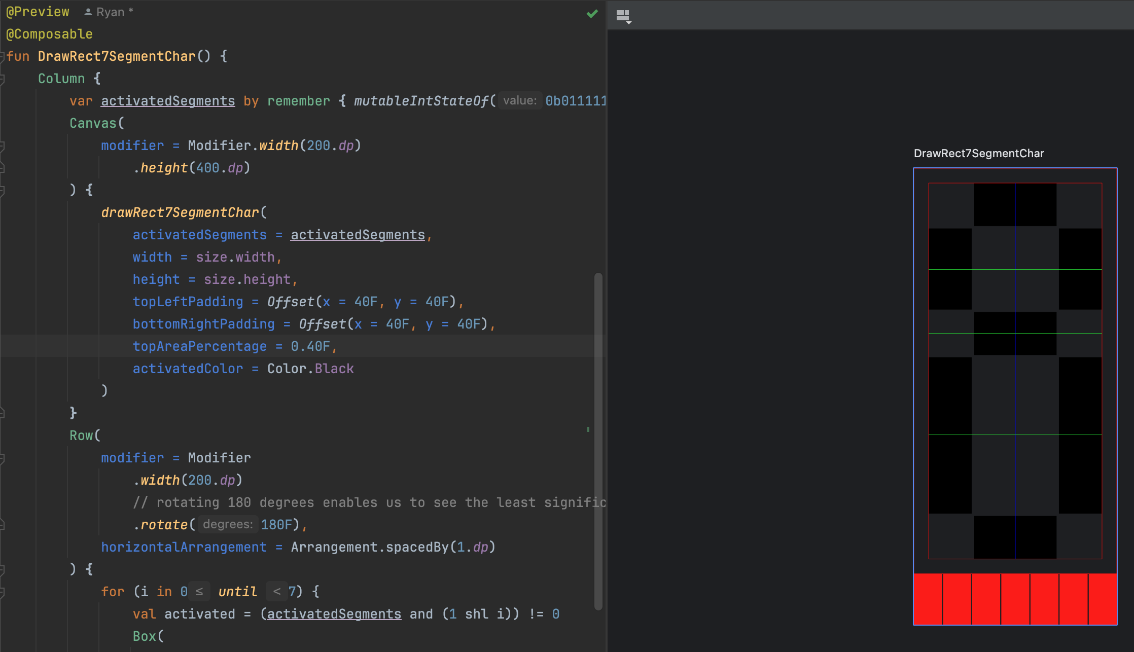
Our debug code is designed to help us verify our calculation of those values. So we cannot use them to verify themselves. We need to calculate the center line of the top and bottom areas and then draw a line at those points. When you're done, your preview should look like this:
Parameterizing the Thickness and Gap Size
We've hardcoded the thickness and gap size. We can parameterize these values as well:
internal fun DrawScope.drawHex7SegmentChar(
    activatedSegments: Int,
    width: Float,
    height: Float,
    topLeftPadding: Offset,
    bottomRightPadding: Offset,
    topHeightPercentage: Float,
    thicknessMultiplier: Float,
    gapSizeMultiplier: Float,
    activatedColor: Color = Color.Black,
    deactivatedColor: Color = activatedColor.copy(alpha = 0.05F),
    debuggingEnabled: Boolean = false
) {
    /* .. */
}
Using these multipliers to calculate the thickness and gap size:
val configuredThickness = 29F / 240.37F * drawableHeight * thicknessMultiplier
val gapSize = configuredThickness / 10 * gapSizeMultiplier
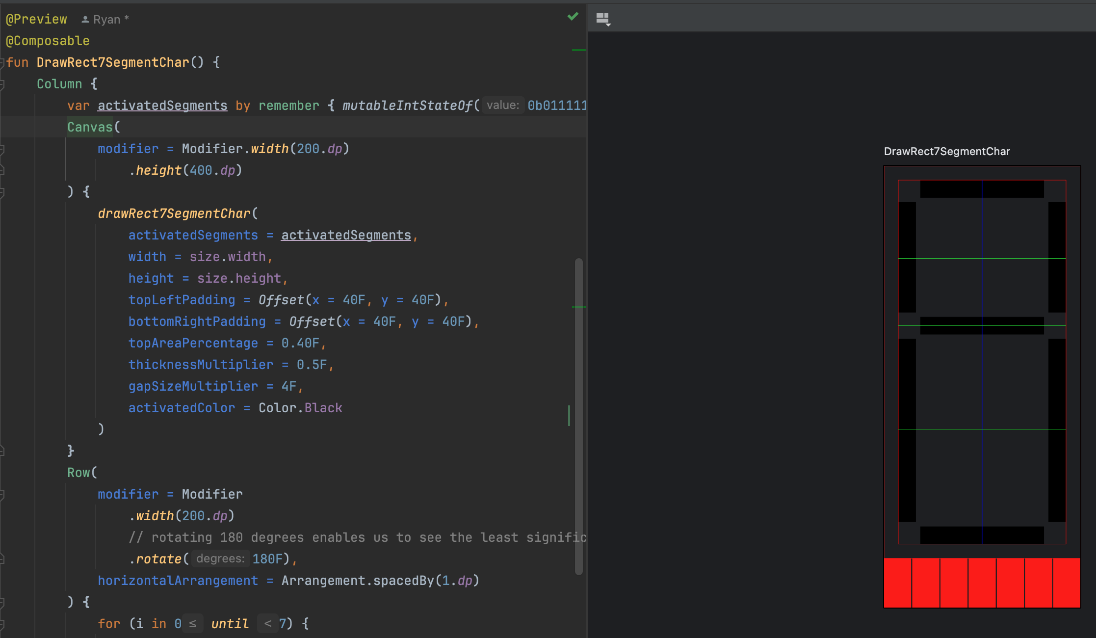
Finally, update the call to the drawRect7SegmentChar function in the preview:
drawRect7SegmentChar(
    activatedSegments = activatedSegments,
    width = size.width,
    height = size.height,
    topLeftPadding = Offset(x = 40F, y = 40F),
    bottomRightPadding = Offset(x = 40F, y = 40F),
    topAreaPercentage = 0.40F,
    thicknessMultiplier = 0.5F,
    gapSizeMultiplier = 4F,
    activatedColor = Color.Black
)
When you're done, you should have a preview that looks like this:
Drawing a Line of Text
At the moment, we can successfully draw a single character onto the top-left of a canvas. However, we're not done until we have a composable function that can take in a String and draw the characters sequentially on a single canvas. In this section we'll transform a character into activated segment integers and create some composable functions that will appropriately lay out a string of characters on a single canvas.
Transforming a String into Segment Activation Ints
First, we have to write a function that will transform a character into an activated segment integer. We'll write a function that takes a Char and returns an Int. I created a new file (segmented-display/src/commonMain/kotlin/com/fsryan/ui/segments/ActivatedSegmentTransformers.kt) and come up with the following:
fun transformCharToActiveSegments(char: Char): Int = when (char) {
    '0' -> 0b01110111
    '1' -> 0b00100100
    '2' -> 0b01011101
    '3' -> 0b01101101
    '4' -> 0b00101110
    '5' -> 0b01101011
    '6' -> 0b01111011
    '7' -> 0b00100101
    '8' -> 0b01111111
    '9' -> 0b01101111
    'A', 'a' -> 0b00111111
    'B', 'b' -> 0b01111010
    'C', 'c' -> 0b01010011
    'D', 'd' -> 0b01111100
    'E', 'e' -> 0b01011011
    'F', 'f' -> 0b00011011
    'G', 'g' -> 0b01110011
    'H', 'h' -> 0b00111010
    'I', 'i' -> 0b00010010
    'J', 'j' -> 0b01100100
    'K', 'k' -> 0b00111011
    'L', 'l' -> 0b01010010
    'M', 'm' -> 0b00111001
    'N', 'n' -> 0b00111000
    'O', 'o' -> 0b01111000
    'P', 'p' -> 0b00011111
    'Q', 'q' -> 0b00101111
    'R', 'r' -> 0b00011000
    'S', 's' -> 0b01100011
    'T', 't' -> 0b01011010
    'U', 'u' -> 0b01110000
    'V', 'v' -> 0b01000110
    'W', 'w' -> 0b01001110
    'X', 'x' -> 0b00111110
    'Y', 'y' -> 0b01101110
    'Z', 'z' -> 0b01010101
    '-' -> 0b00001000
    else -> 0   // <-- cannot render
}
If you assigned a different arrangement of bits to your segments, you'll need to make the appropriate adjustments to your transform function
You don't have to use this exact function, either. Just use what looks good to you.
Rendering Multiple Characters on a Canvas
Ultimately, we want to be able to style our display differently than just with seven rectangular segments. Therefore, it's best to create a composable function that handles the layout of multiple characters and then delegates to a function that will draw the character. Here, we really need two composable functions:
- To draw any single line of segmented characters to a canvas, ensuring that the characters are drawn sequentially with no overlap
- To wrap the funciton above, using our
DrawScope.drawRect7SegmentCharfunction as the delegate to draw a rectangular 7-segment character for each character
But first we need to parameterize the origin in the drawRect7SegmentChar function. Thankfully, this is just a matter of taking a hardcoded value and making it a parameter. Now the drawRect7SegmentChar function looks like this:
fun DrawScope.drawRect7SegmentChar(
    origin: Offset,
    activatedSegments: Int,
    width: Float,
    height: Float,
    topLeftPadding: Offset,
    bottomRightPadding: Offset,
    topAreaPercentage: Float,
    thicknessMultiplier: Float,
    gapSizeMultiplier: Float,
    activatedColor: Color,
    deactivatedColor: Color = activatedColor.copy(alpha = 0.05F),
    debuggingEnabled: Boolean = true
) {
    // here we need to delete the hardcoded `origin`
    /* ... */
}
Now let's write a composable function to draw any segmented display to the canvas in a new file segmented-display/src/commonMain/kotlin/com/fsryan/ui/segments/SingleLineSegmentedDisplay.kt:
@Composable
fun SingleLineSegmentedDisplay(
    modifier: Modifier = Modifier,
    text: String,
    renderCharOnCanvas: DrawScope.(idx: Int, char: Char, offset: Offset, charWidth: Float, charHeight: Float) -> Unit
) {
    Canvas(modifier = modifier.fillMaxSize()) {
        val charWidth = size.width / text.length
        text.forEachIndexed { idx, char ->
            val offset = Offset(x = idx * charWidth, y = 0F)
            renderCharOnCanvas(idx, char, offset, charWidth, size.height)
        }
    }
}
Here, we create the canvas, calculating the horizontal space to allocate to each character by dividing the available width equally. Additionally, the function accepts a function that will draw the character on the canvas. This function will be called for each character in the string.
Now let's wrap this function, passing in our drawRect7SegmentChar function as the delegate, in the previous file (segmented-display/src/commonMain/kotlin/com/fsryan/ui/segments/Rect7SegmentDisplay.kt):
@Composable
fun Rect7SegmentDisplay(
   modifier: Modifier = Modifier,
   text: String,
   paddingValues: PaddingValues = PaddingValues(4.dp),
   topAreaPercentage: Float = 0.495F,
   thicknessMultiplier: Float = 1F,
   gapSizeMultiplier: Float = 1F,
   activatedColor: Color = Color.Black,
   deactivatedColor: Color = activatedColor.copy(alpha = 0.05F),
   charToActivatedSegments: (Char) -> Int = ::transformCharToActiveSegments
) {
   val density = LocalDensity.current.density
   val layoutDirection = LocalLayoutDirection.current
   val topLeftPadding = Offset(
      x = paddingValues.calculateLeftPadding(layoutDirection).value * density,
      y = paddingValues.calculateTopPadding().value * density
   )
   val bottomRightPadding = Offset(
      x = paddingValues.calculateRightPadding(layoutDirection).value * density,
      y = paddingValues.calculateBottomPadding().value * density
   )
   SingleLineSegmentedDisplay(modifier = modifier, text = text) { _, char, origin, charWidth, charHeight ->
      drawRect7SegmentChar(
         activatedSegments = charToActivatedSegments(char),
         origin = origin,
         width = charWidth,
         height = charHeight,
         gapSizeMultiplier = gapSizeMultiplier,
         topLeftPadding = topLeftPadding,
         topAreaPercentage = topAreaPercentage,
         bottomRightPadding = bottomRightPadding,
         thicknessMultiplier = thicknessMultiplier,
         activatedColor = activatedColor,
         deactivatedColor = deactivatedColor,
         debug
      )
   }
}
Finally, let's make a compose preview function in our previous preview file (segmented-display/src/androidDebug/kotlin/com/fsryan/ui/segments/Rect7SegmentDisplayPreview.kt):
@Preview(widthDp = 800)
@Composable
fun RectangularHexCharacters() {
    Column {
        Rect7SegmentDisplay(
            modifier = Modifier.background(Color.LightGray)
                .width(800.dp)
                .height(200.dp),
            text = "01234567",
            thicknessMultiplier = 0.6F,
            activatedColor = Color.Black
        )
        Rect7SegmentDisplay(
            modifier = Modifier.background(Color.LightGray)
                .width(800.dp)
                .height(200.dp),
            thicknessMultiplier = 0.6F,
            gapSizeMultiplier = 0.75F,
            text = "89ABCDEF",
            activatedColor = Color.Black
        )
    }
}
When you're done, your preview should look like this:
Testing on Each Platform
That was quite the effort to get to this point. But now we can:
- Delete our
SampleComposablefunction from part 1 of this series - Demo our rectangular 7-segment display in our composeApp
Update the composeApp/src/commonMain/App.kt file's App composable function like this:
@Composable
@Preview
fun App() {
    MaterialTheme {
        var showContent by remember { mutableStateOf(false) }
        Column(Modifier.fillMaxWidth(), horizontalAlignment = Alignment.CenterHorizontally) {
            Button(onClick = { showContent = !showContent }) {
                Text("Click me!")
            }
            AnimatedVisibility(showContent) {
                BoxWithConstraints {
                    val width = maxWidth
                    Column(Modifier.fillMaxWidth(), horizontalAlignment = Alignment.CenterHorizontally) {
                        Rect7SegmentDisplay(
                            modifier = Modifier.background(Color.LightGray)
                                .fillMaxWidth()
                                .height(width / 4),
                            text = "01234567",
                            thicknessMultiplier = 0.6F,
                            activatedColor = Color.Red
                        )
                        Rect7SegmentDisplay(
                            modifier = Modifier.background(Color.LightGray)
                                .fillMaxWidth()
                                .height(width / 4),
                            thicknessMultiplier = 0.6F,
                            gapSizeMultiplier = 0.75F,
                            text = "89ABCDEF",
                            activatedColor = Color.Red
                        )
                    }
                }
            }
        }
    }
}
Now you can run the app on each platform to see the results. You can check your app on each target by following this guide. Instead of seeing just a blue background. This time, you should see your segmented display appear when you click "Click me!"
Conclusion
This has been a long article, but we've accomplished much. We've . . .
- created a rectangular 7-segment display that can be used to render text
- parameterized the display such that the user of our library can configure the basic look and feel of the segmented characters
- verified our display looks correct using compose previews
- tested that our display works on Android, desktop, iOS, and web.
For those who chose to go through the Canvas Basics section section, you also got a brief introduction to working with the Canvas and some basic drawing techniques.